Photography by Jack Thompson
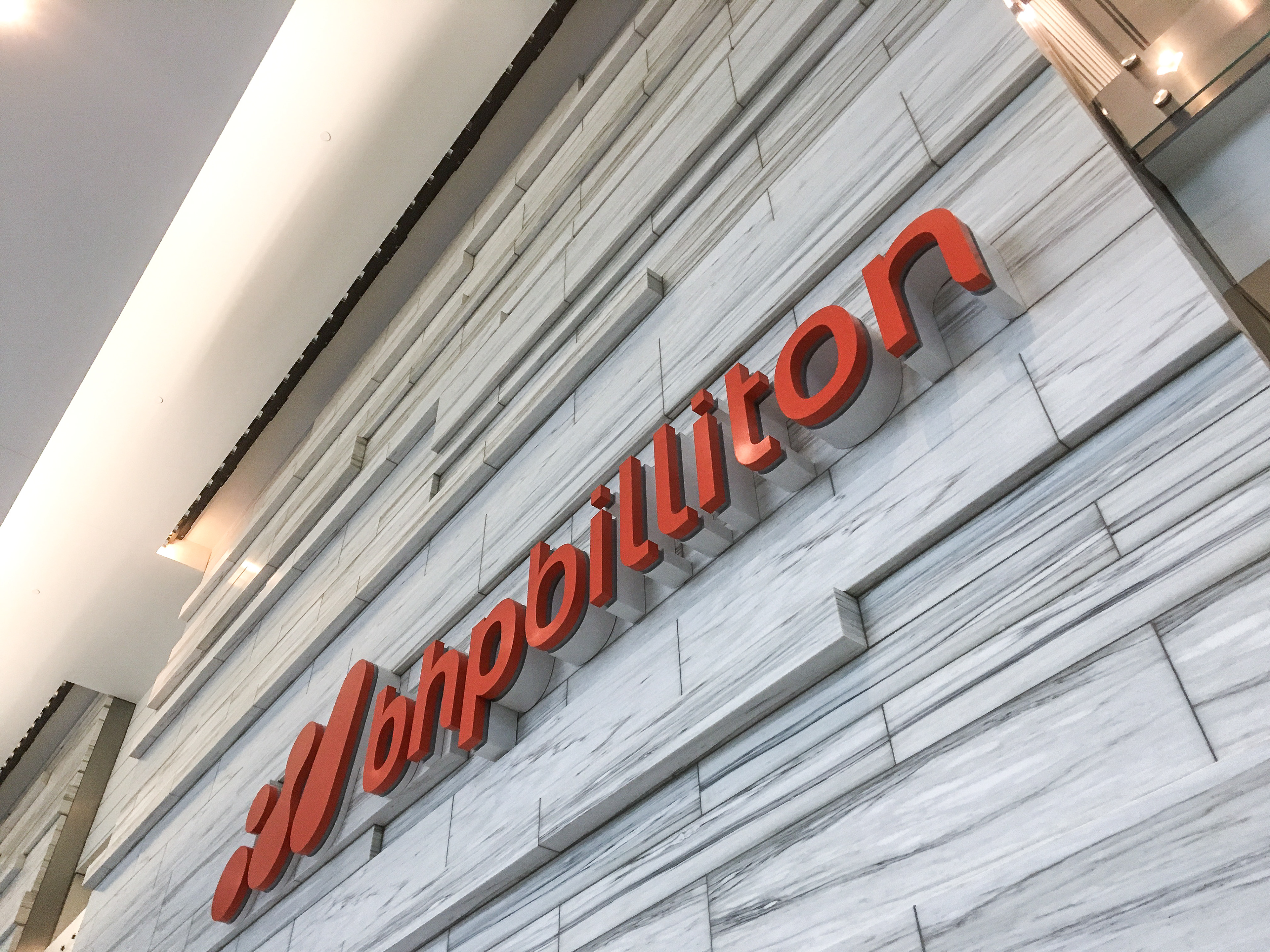
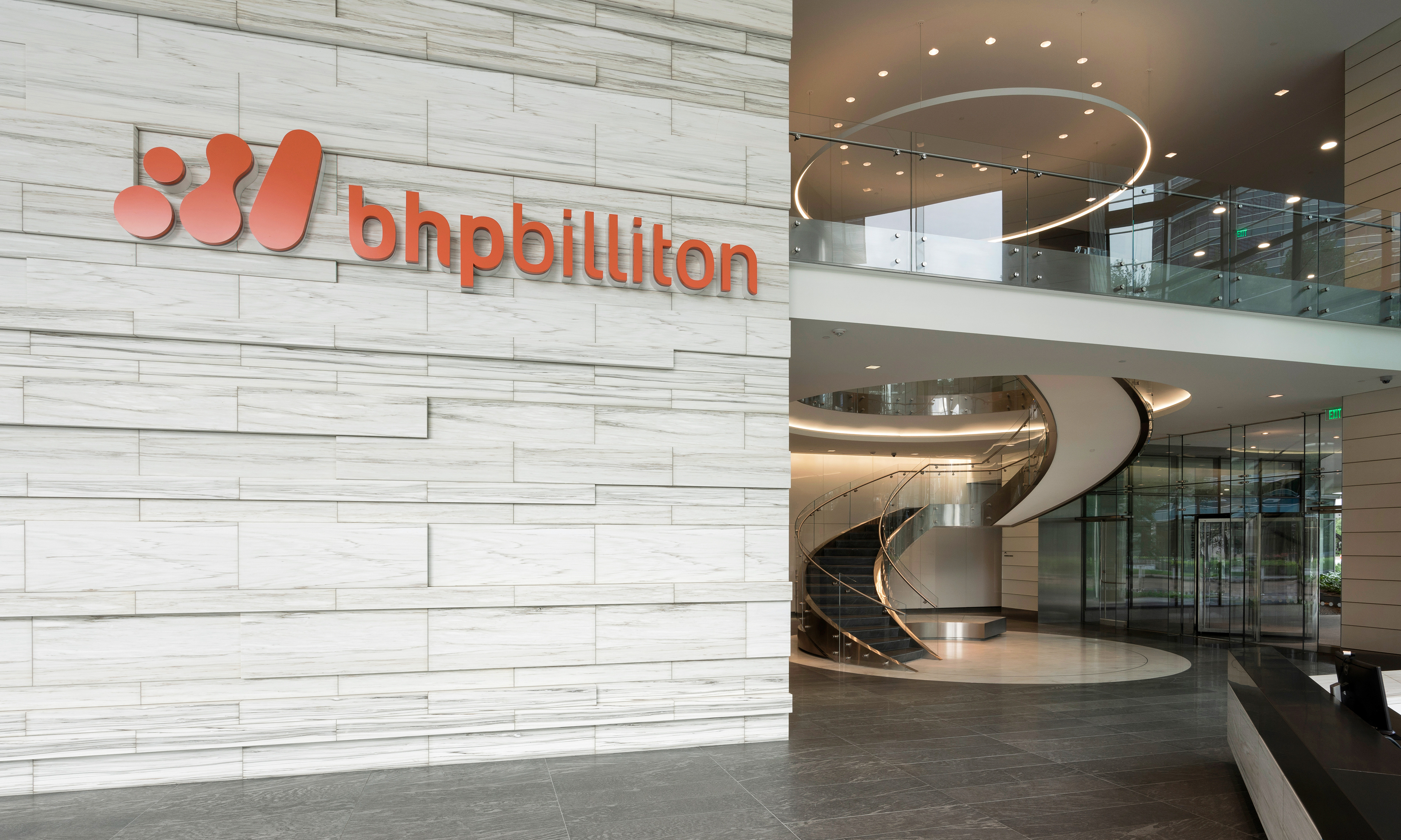
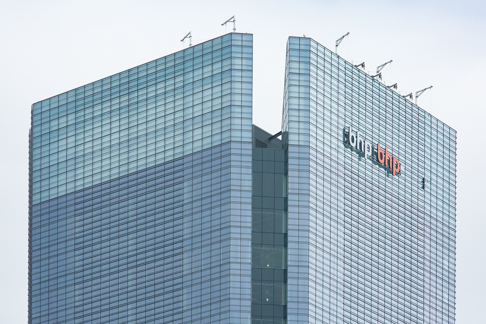
It may not seem like much to place a logo on a stone wall, but this stone wall has many different surface planes at different depths. The back of the logo forms had to marry perfectly to the wall surface without any gaps. And per our design preference the faces had to remain coplanar with one another, which is what made fabrication and implementation more difficult. The stone surface also could not be penetrated to anchor the sign to the surface. We had to come up with a bespoke mounting solution that made use of the 1/8" joints.
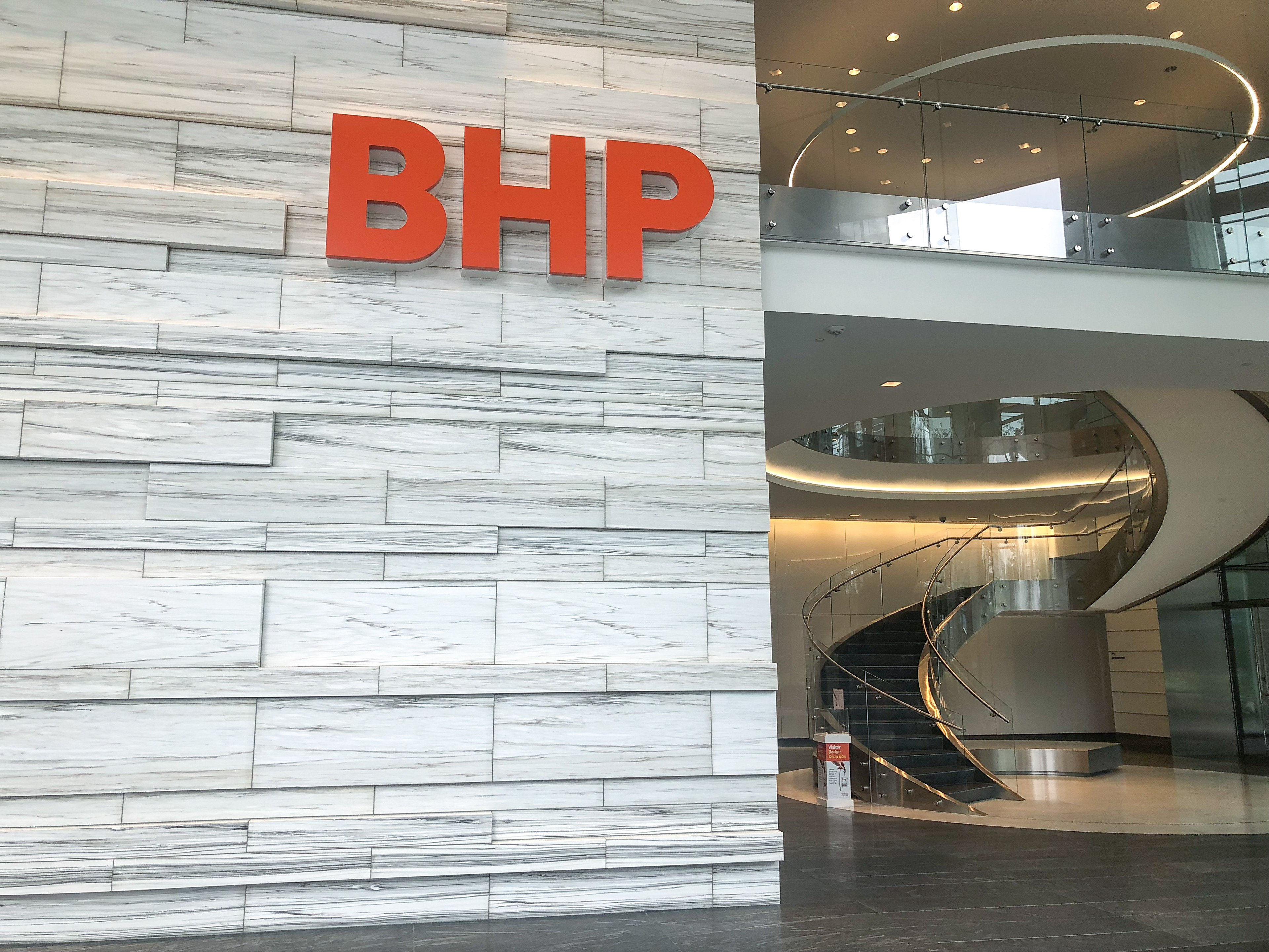
Not long after the original logo went up on the wall, the company went through a global rebrand. Luckily we did not anchor the signage into the stone and removing it to replace with the new logo was an easy process. Photography provided by Gensler Architects.
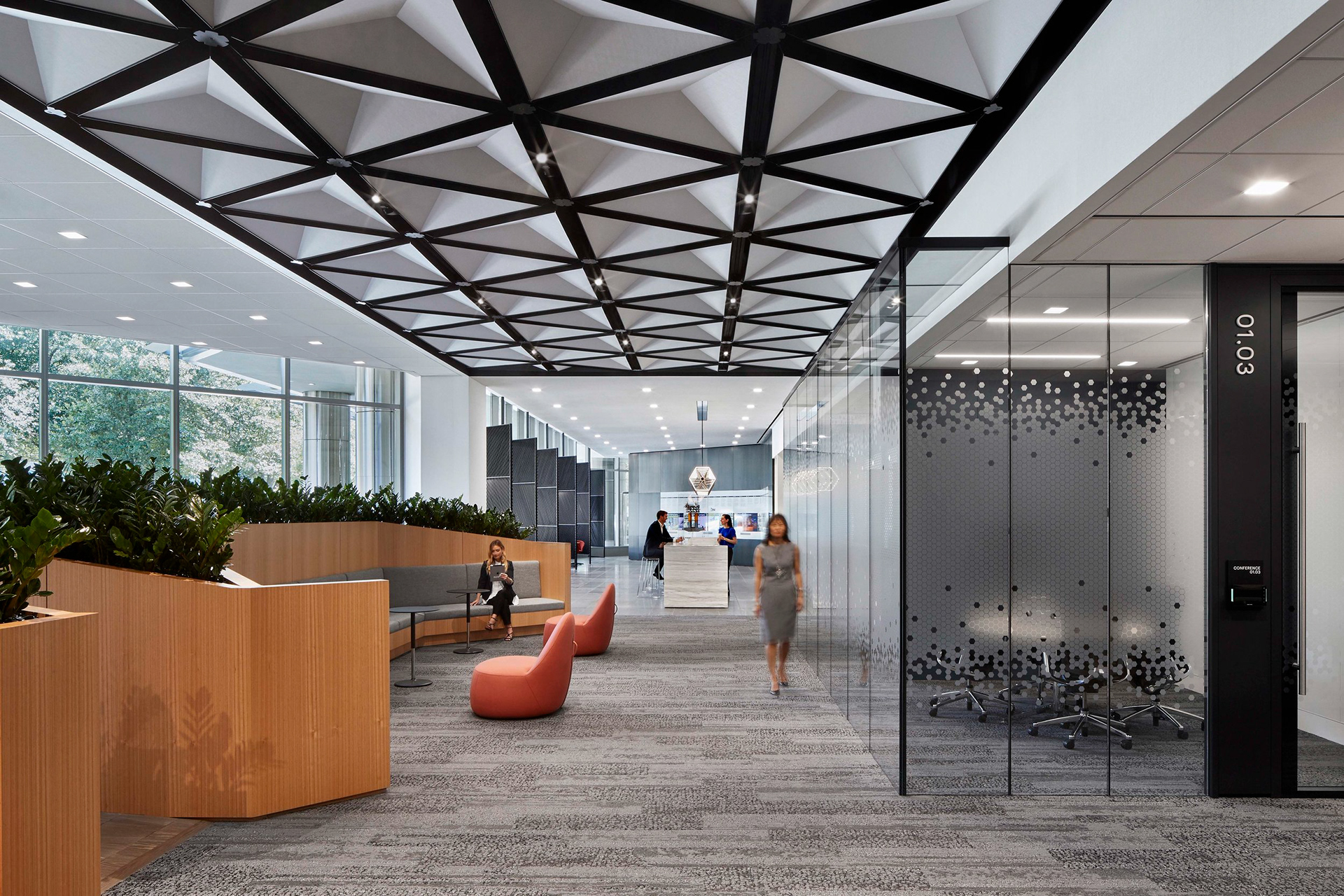
Another shot from the business center entrance looking down to the very back. Conference room line the walls on the left and back. Great interior design work by Gensler Architects.
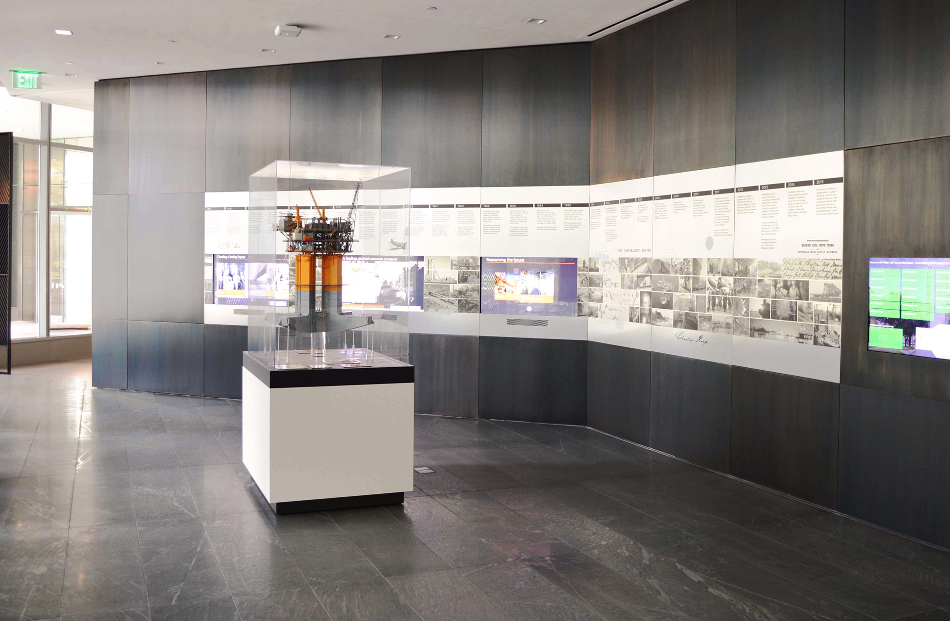

BHP has a vast and rich history that they wanted to display in their business center. The amount of effort to coordinate this timeline piece is hard to convey. Every line of text and every image had to be reviewed and approved by the company. The layout and overall design had to be approved and coordinated. The fabrication specifications went through extensive prototyping and testing to get right. Additionally, everything had to work around the three kiosk screens that sit behind the display. The overall design was based on precedent of a previous timeline BHP created in another building, but all content, content scale, timeline sizing and architectural integration were unique for the preferences and conditions of this new building.
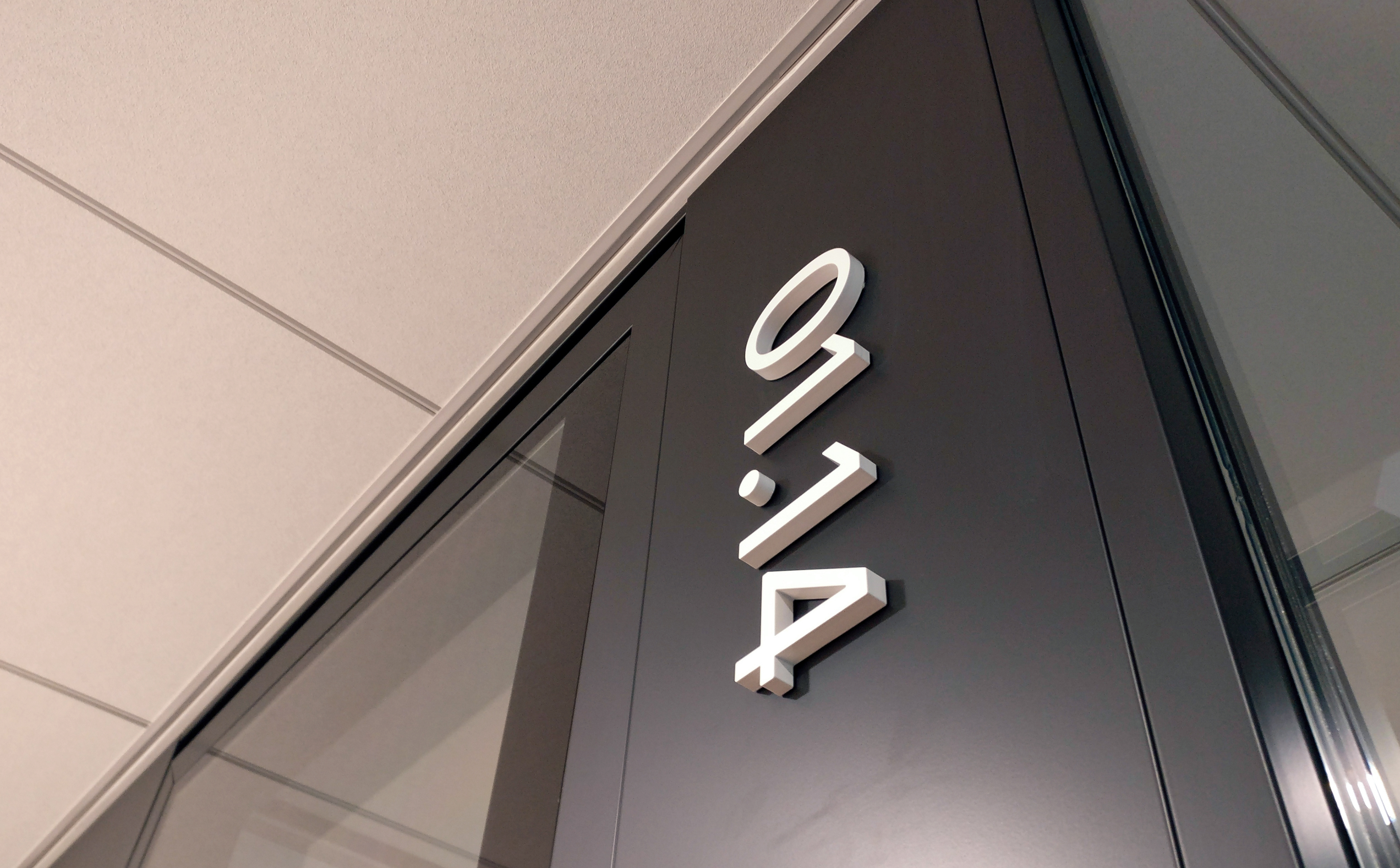
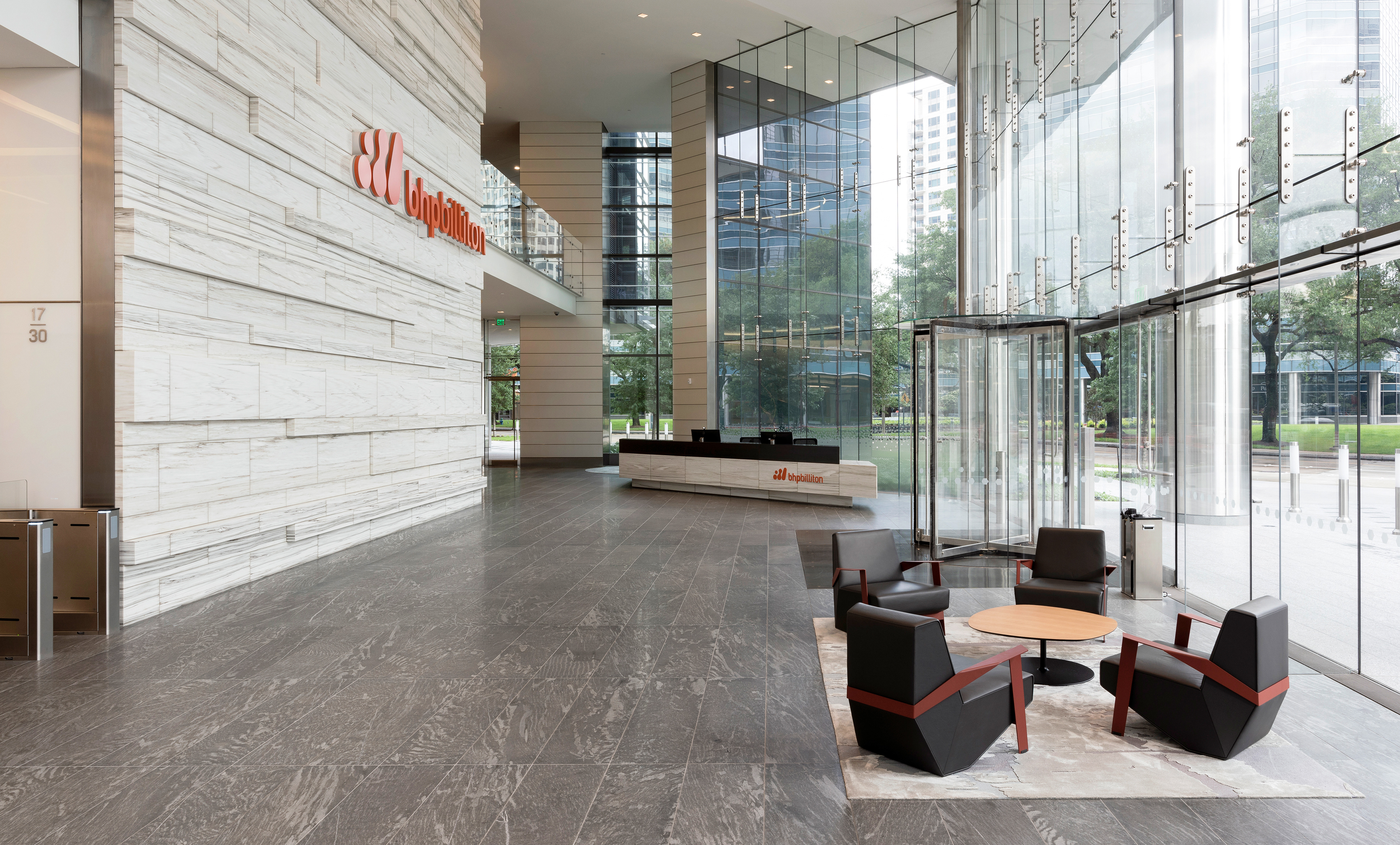
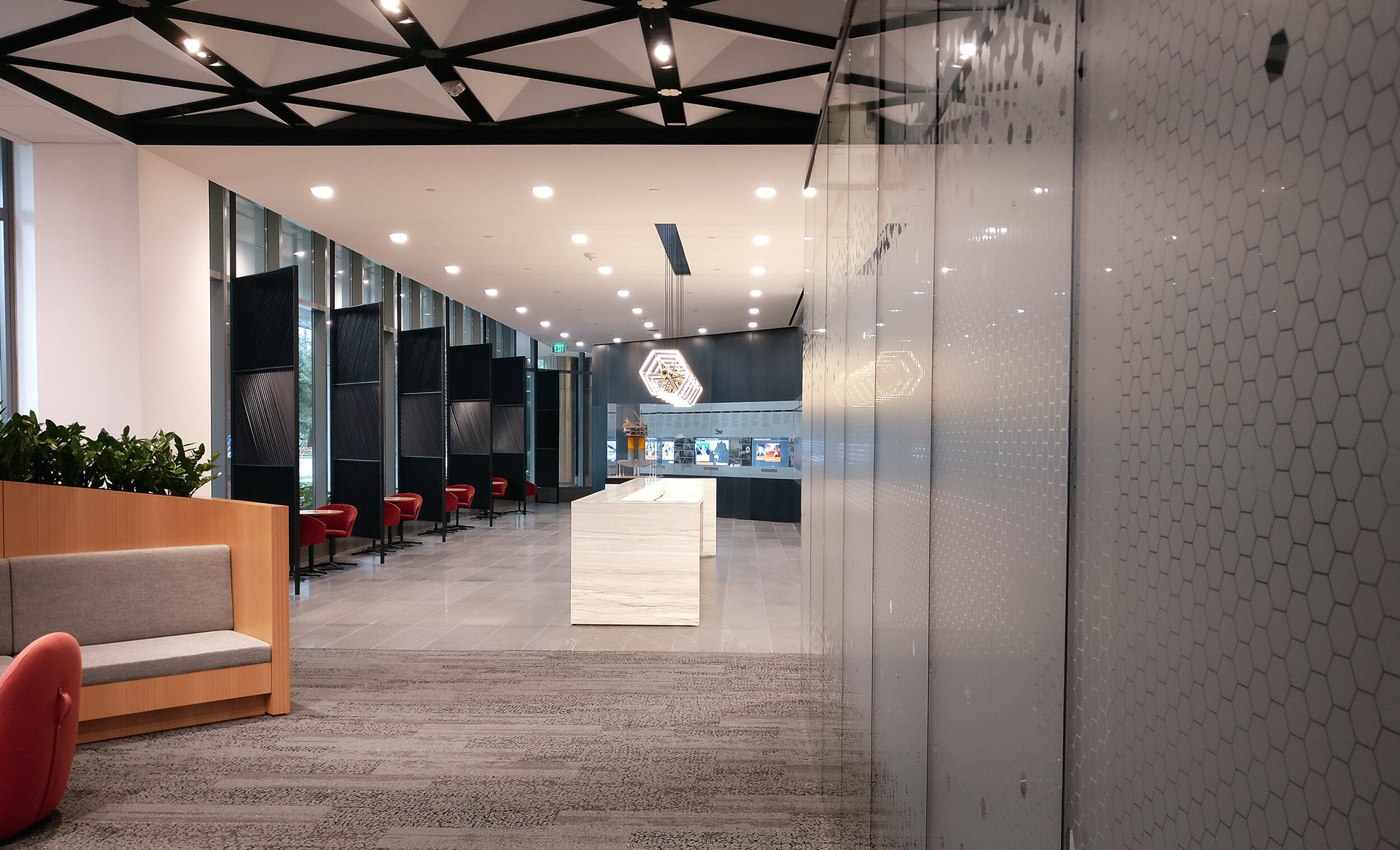
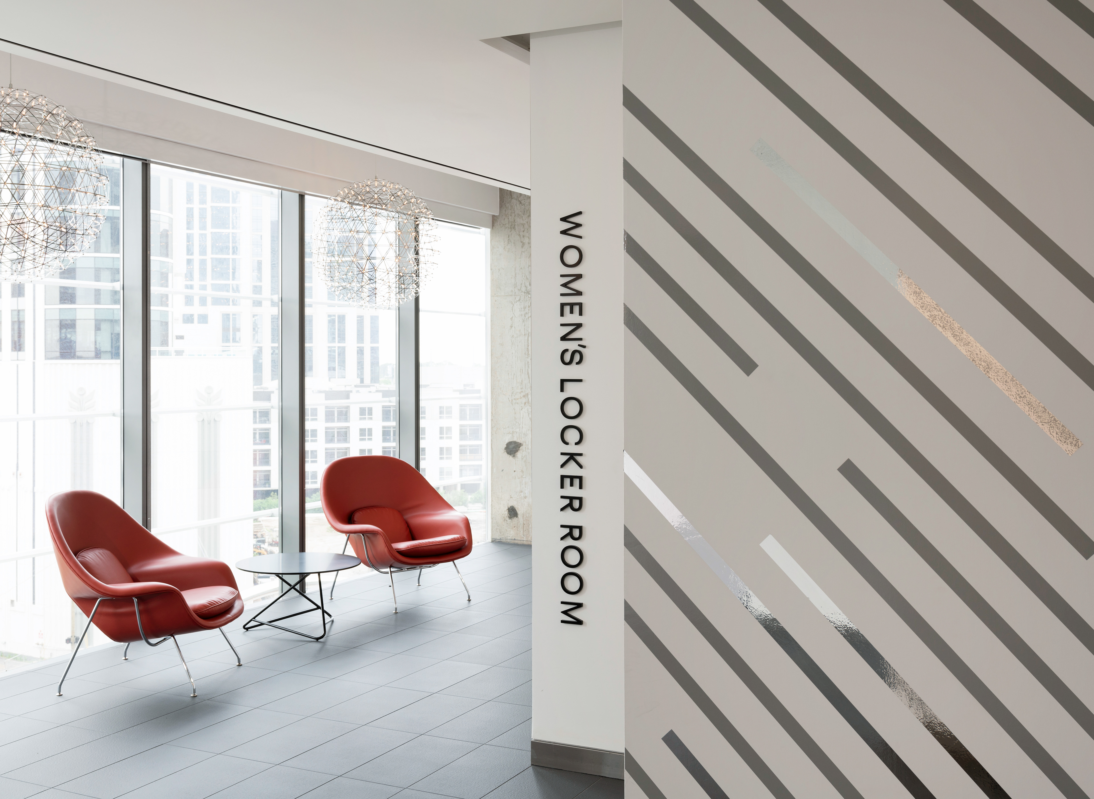
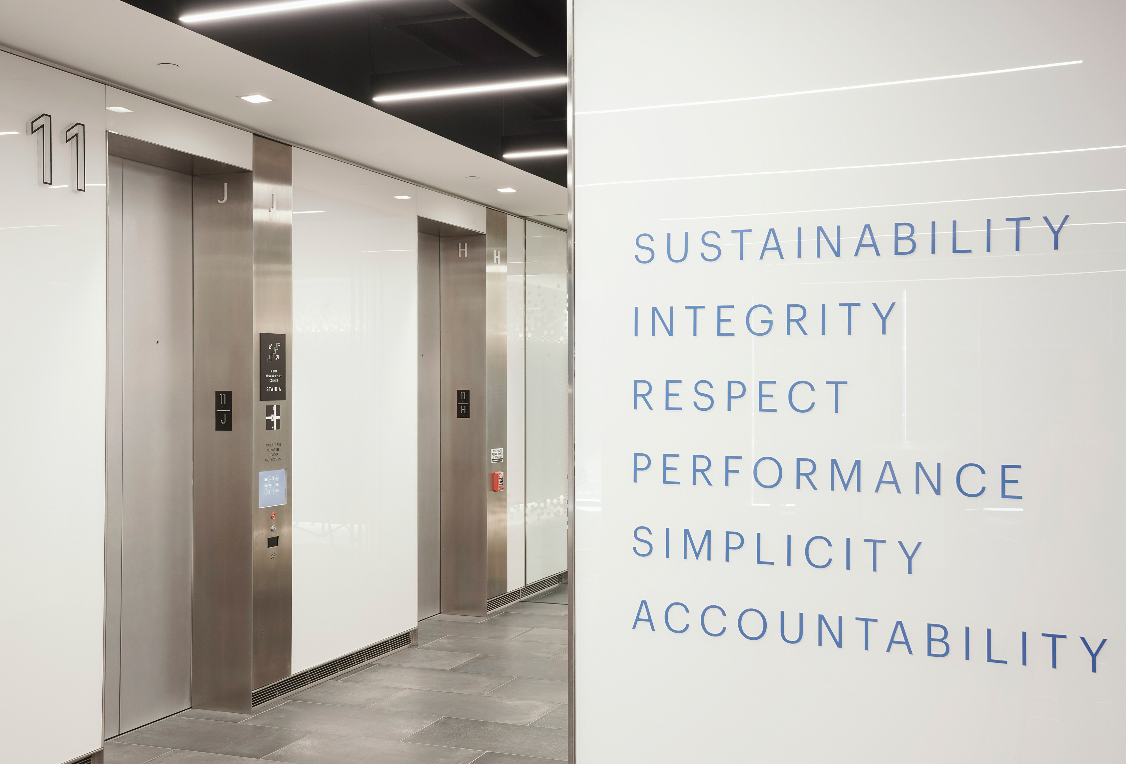
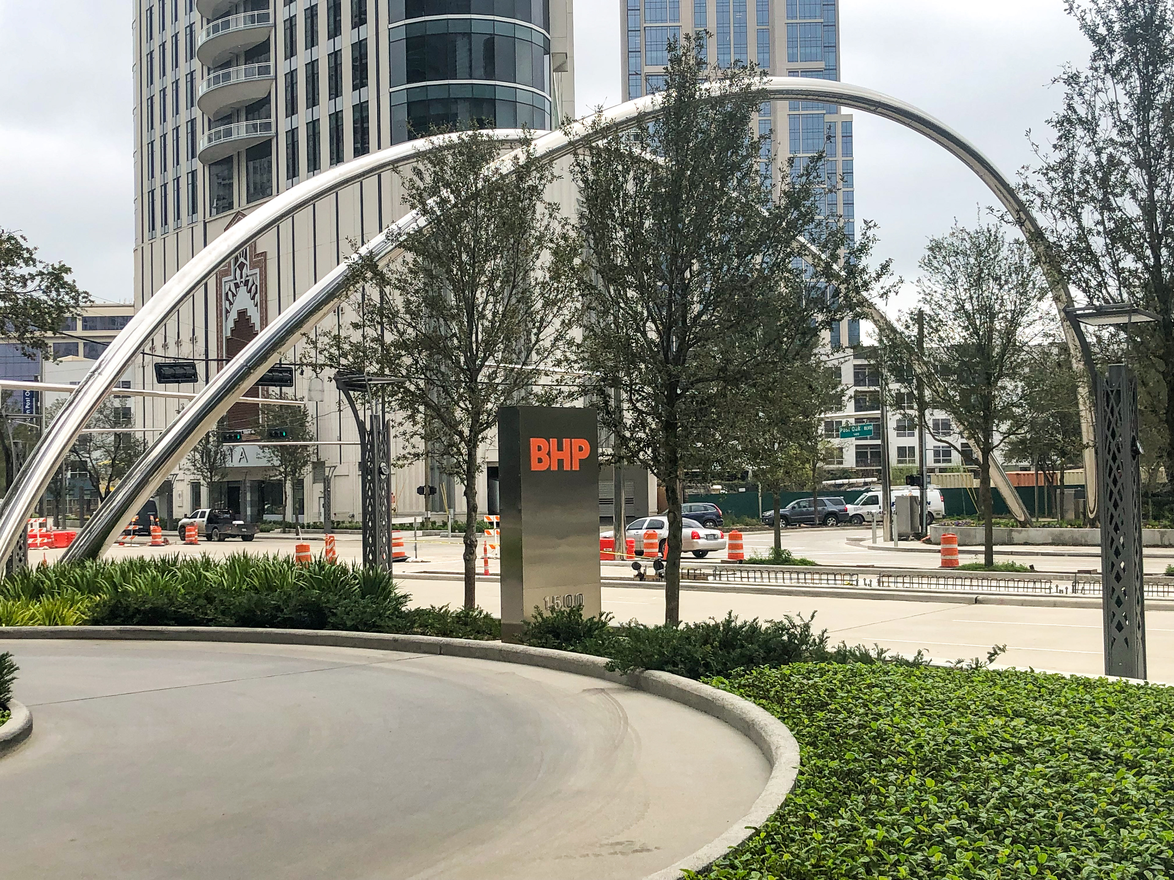
The business center signage was very minimal and simple. It was meant to melt into the landscape rather than appear obtrusive. Vertical identifications were apart of a building wide design concept to have all destinations set in the same visual aesthetic but change in color and thickness depending on importance and function.
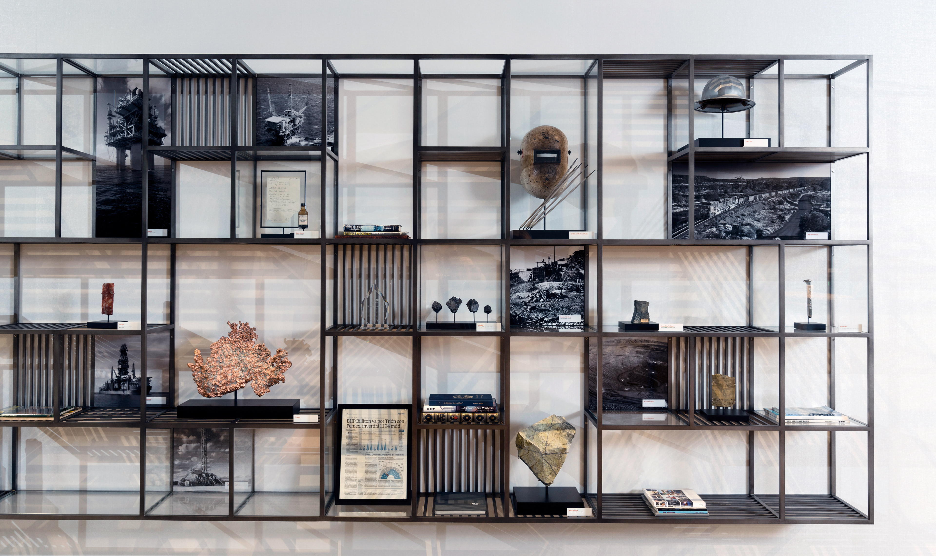
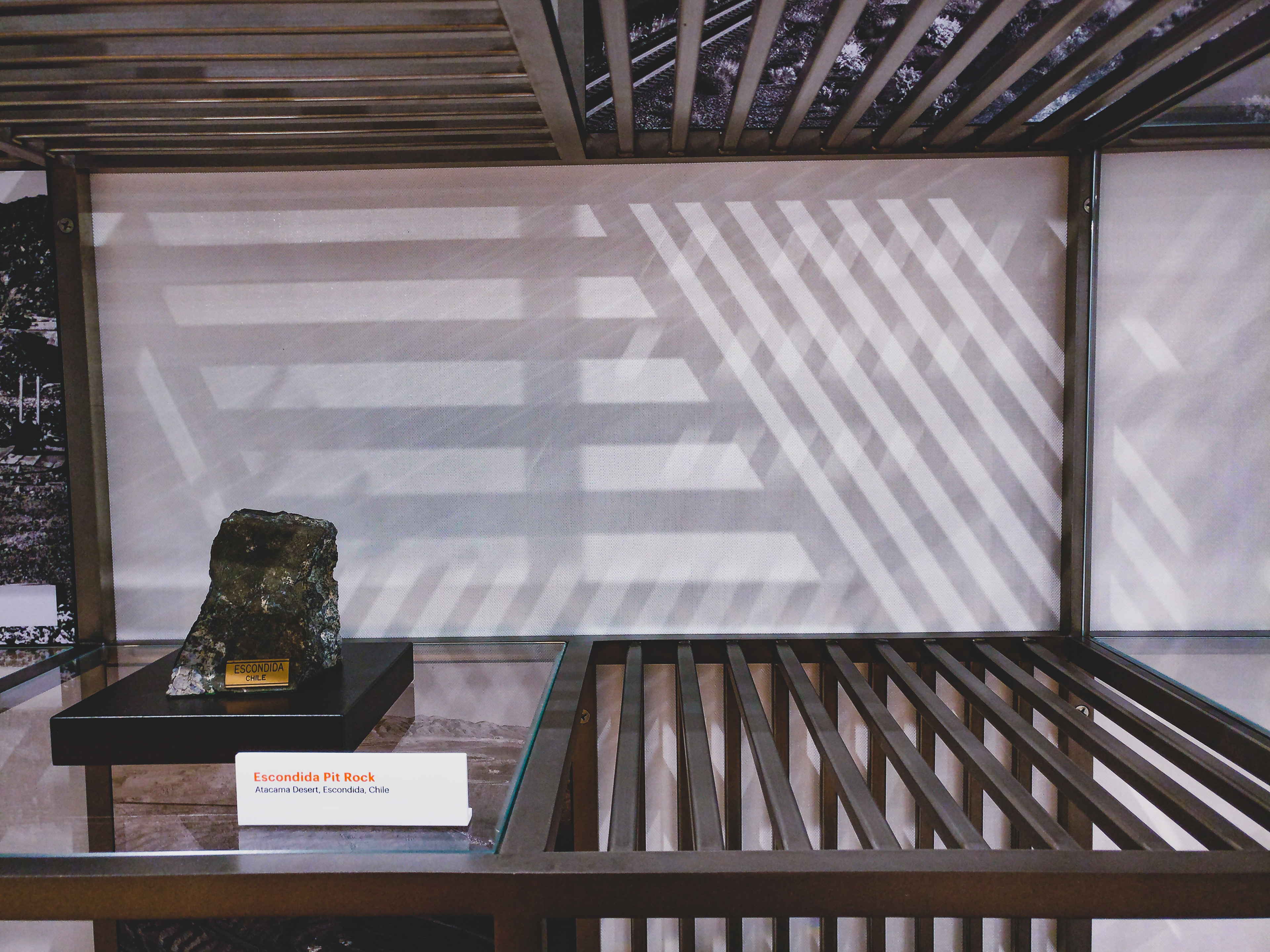
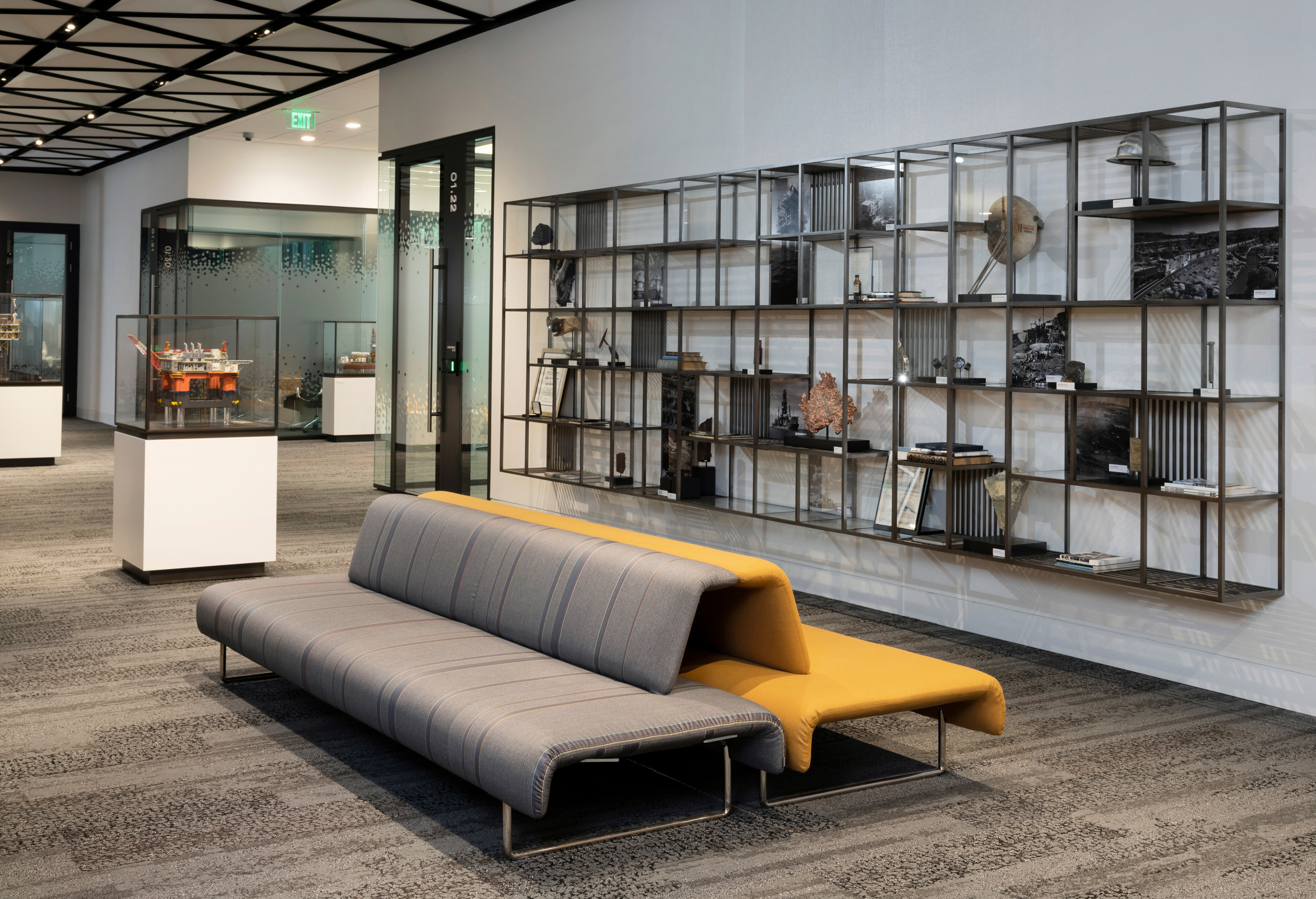
Gensler Architects gave us an opportunity to do some design work in conceptualizing a bookcase design to pay tribute to BHP's long history. The design makes use all of planes within the case structure, some spaces have bottoms and walls of glass, some metal and some are open.


Photography by Jack Thompson

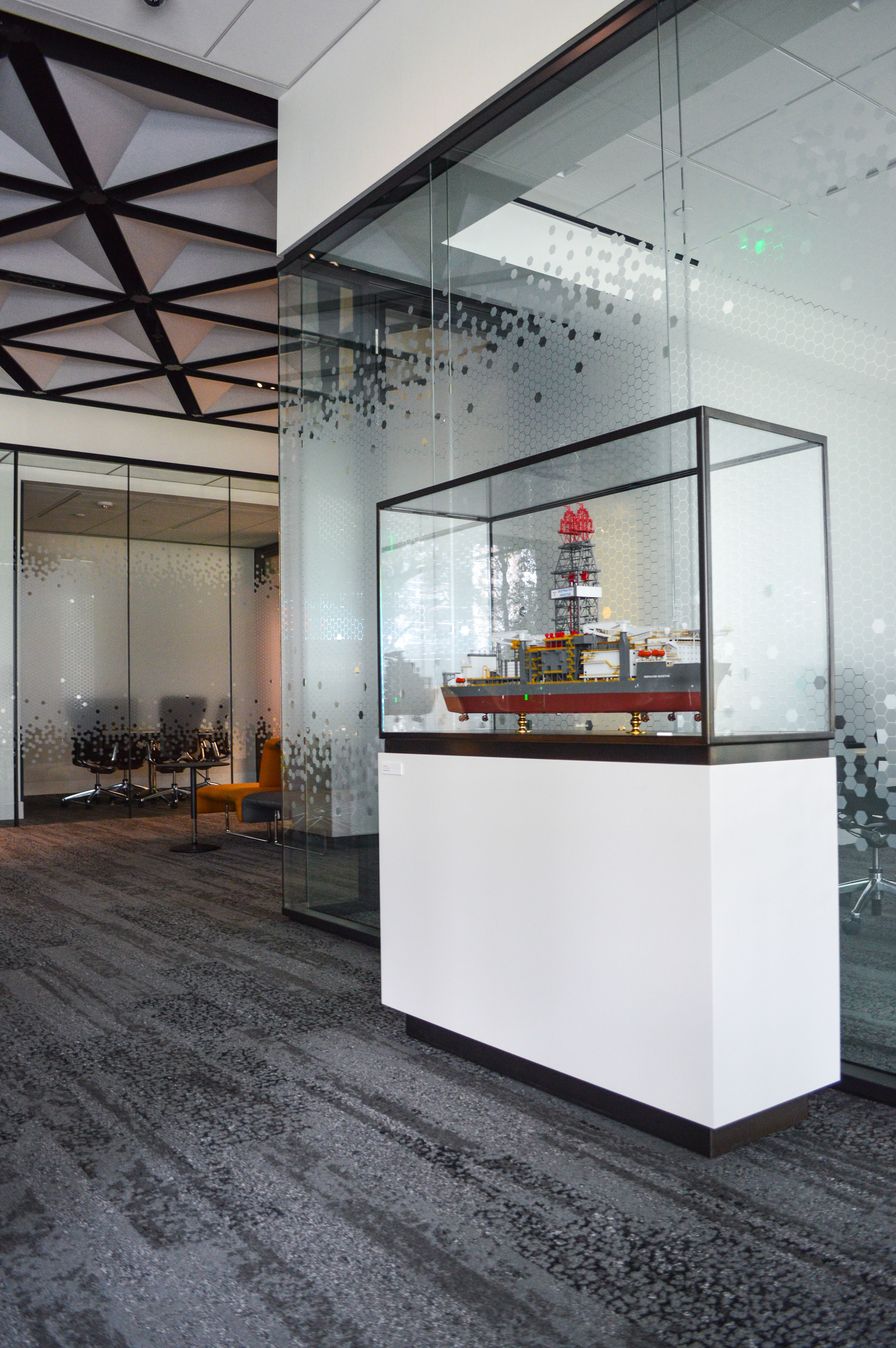

In addition to the book case design, we were also tasked with creating a case design for a handful of ship and oil rig models the company wanted to preserve and display. The design tied in with the overall design aesthetic throughout the space and the bookcase design. Bespoke labels were created for all model, artifact and art pieces throughout the building.
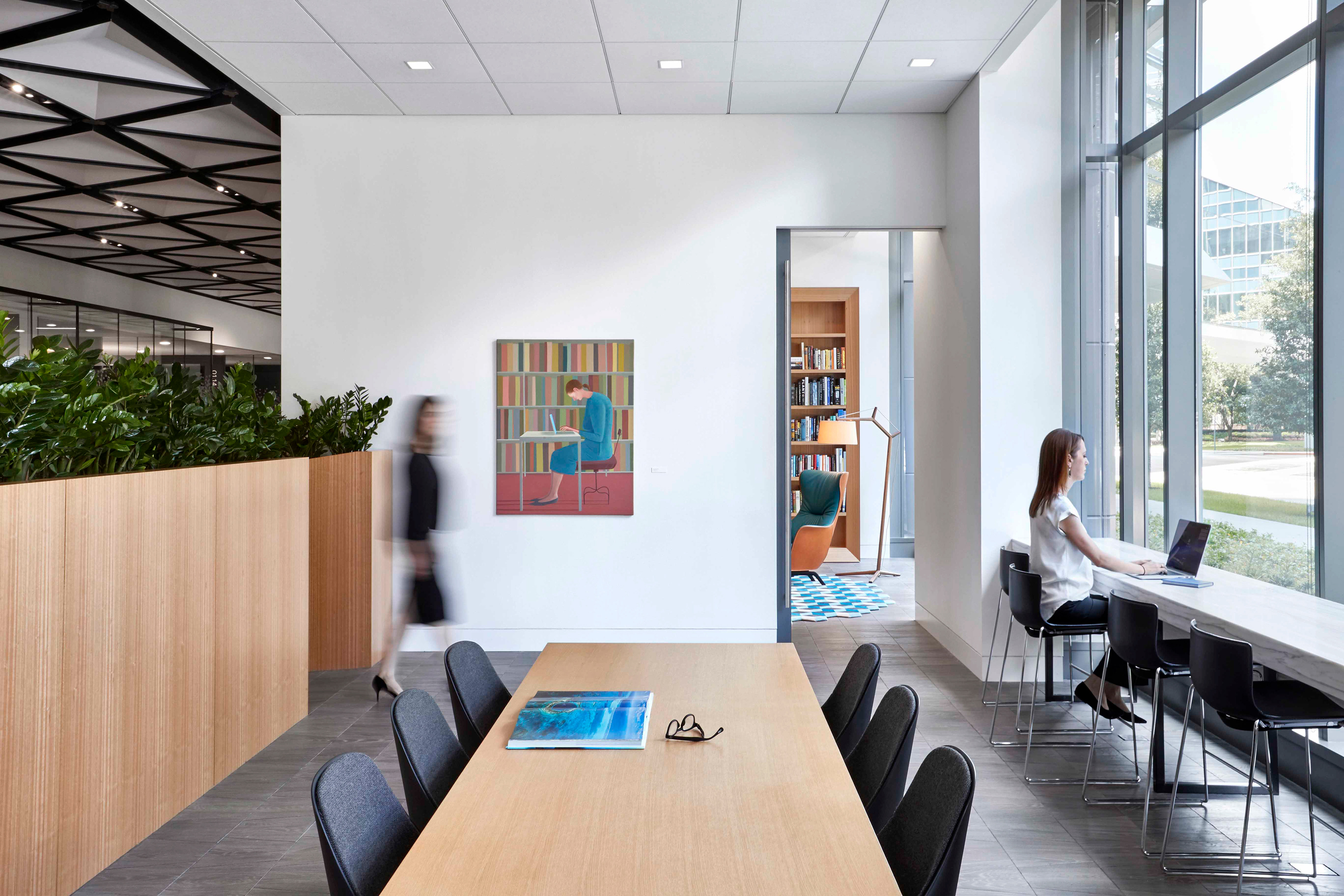
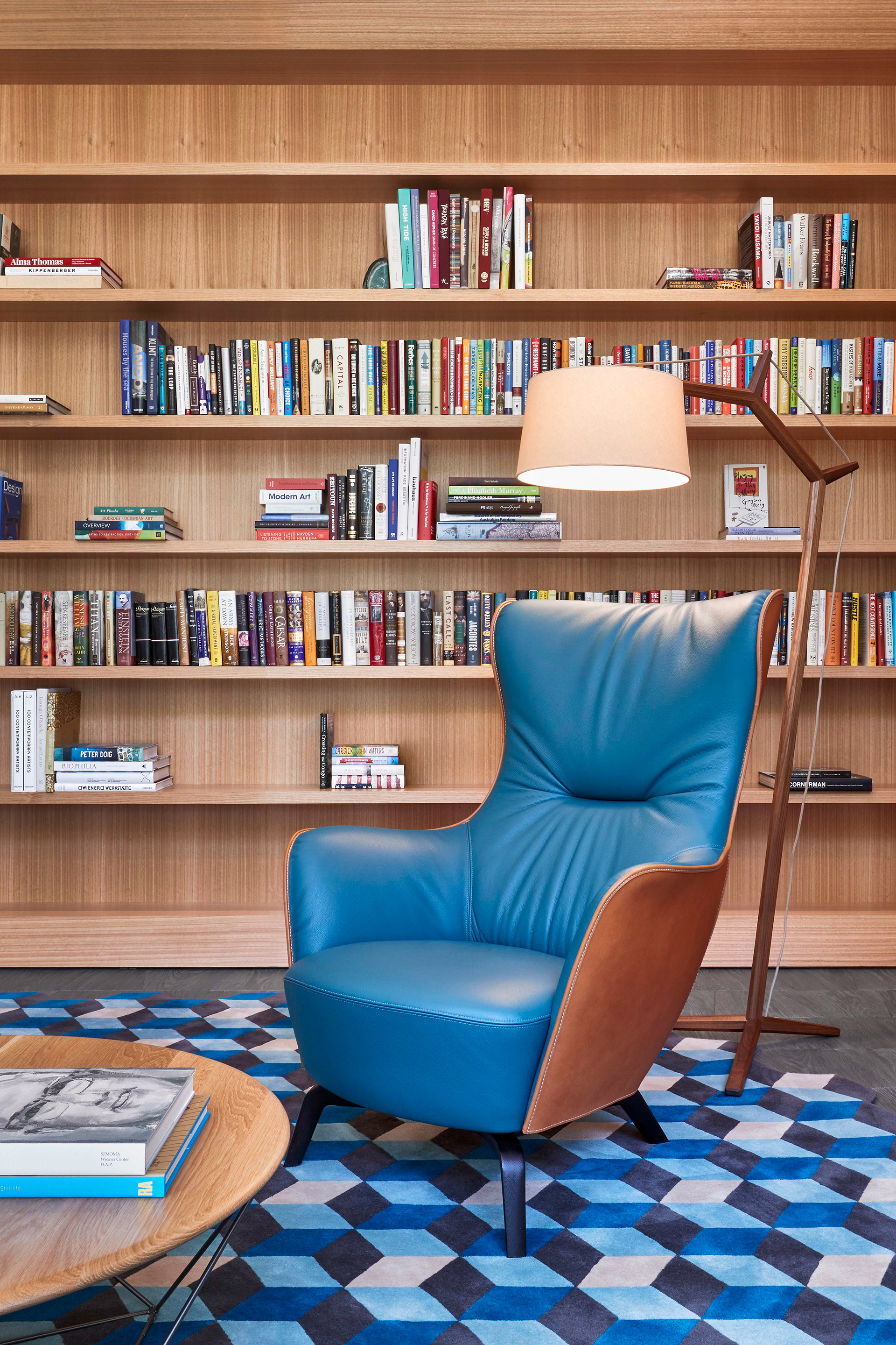
Off in the corner behind the far wall is a library. It makes a great spot to get away and catch up on some reading. Photography by Gensler Architects.
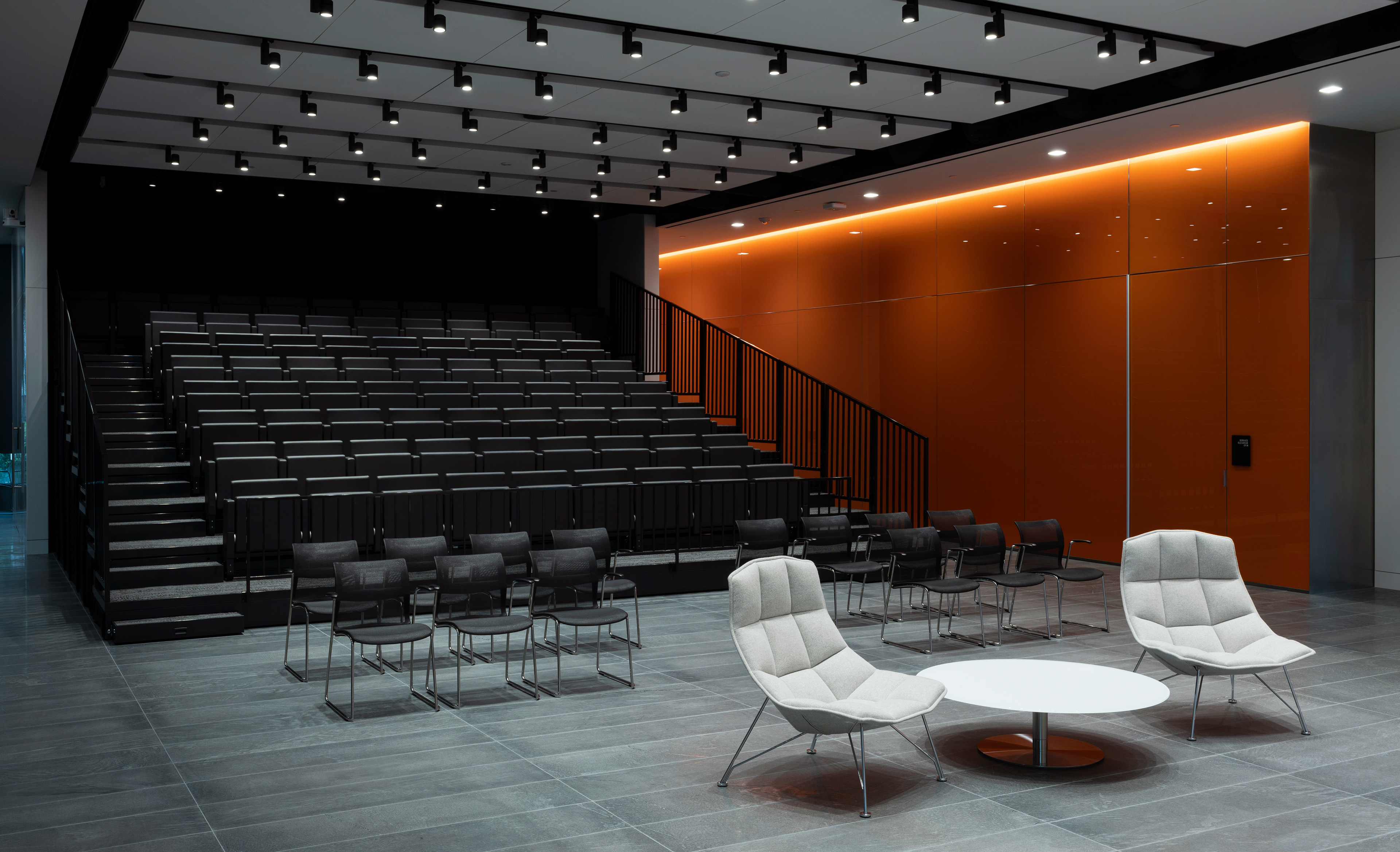
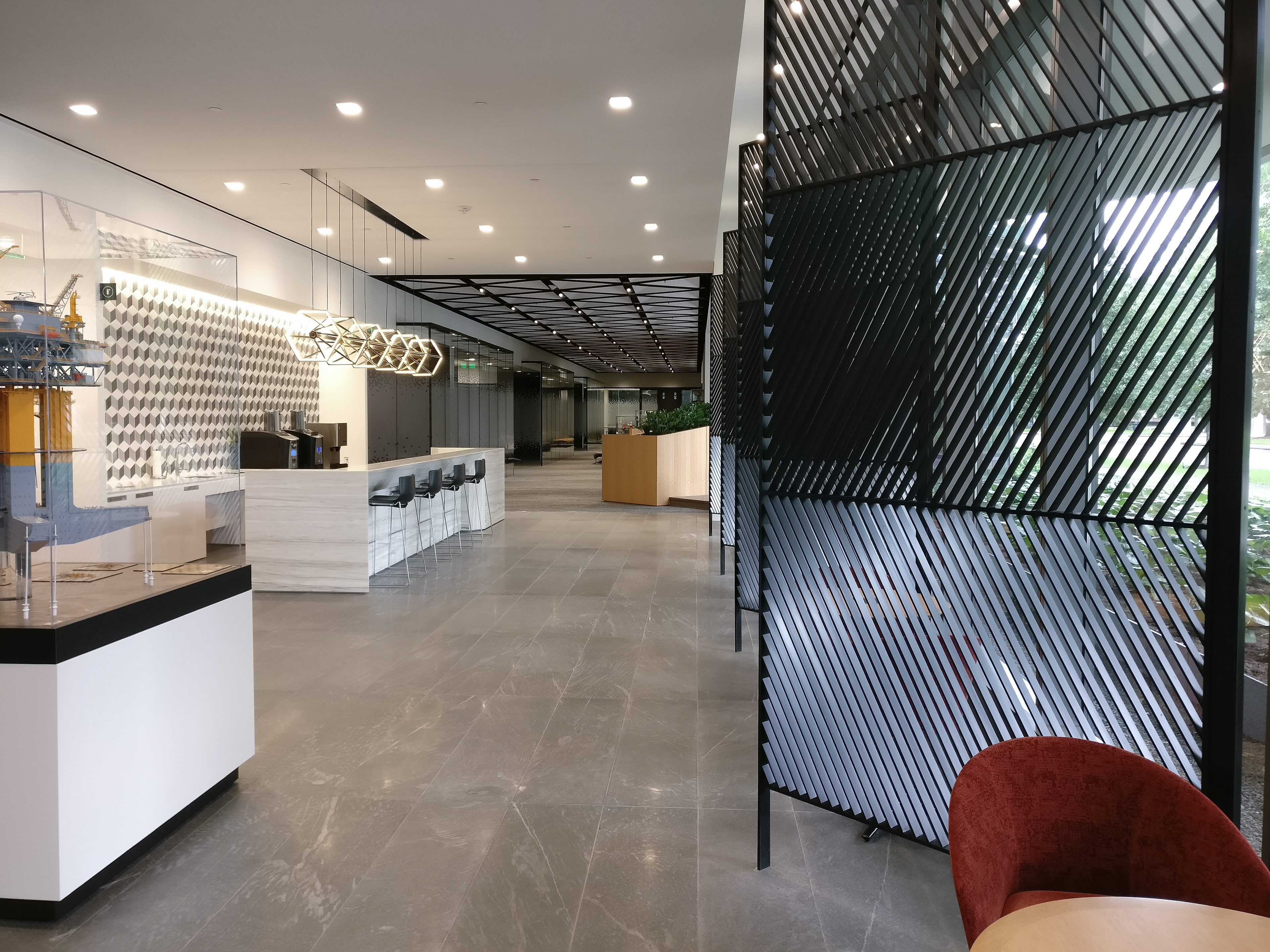
A beautifully designed interior space by Gensler Architects. Photography by Jack Thompson.

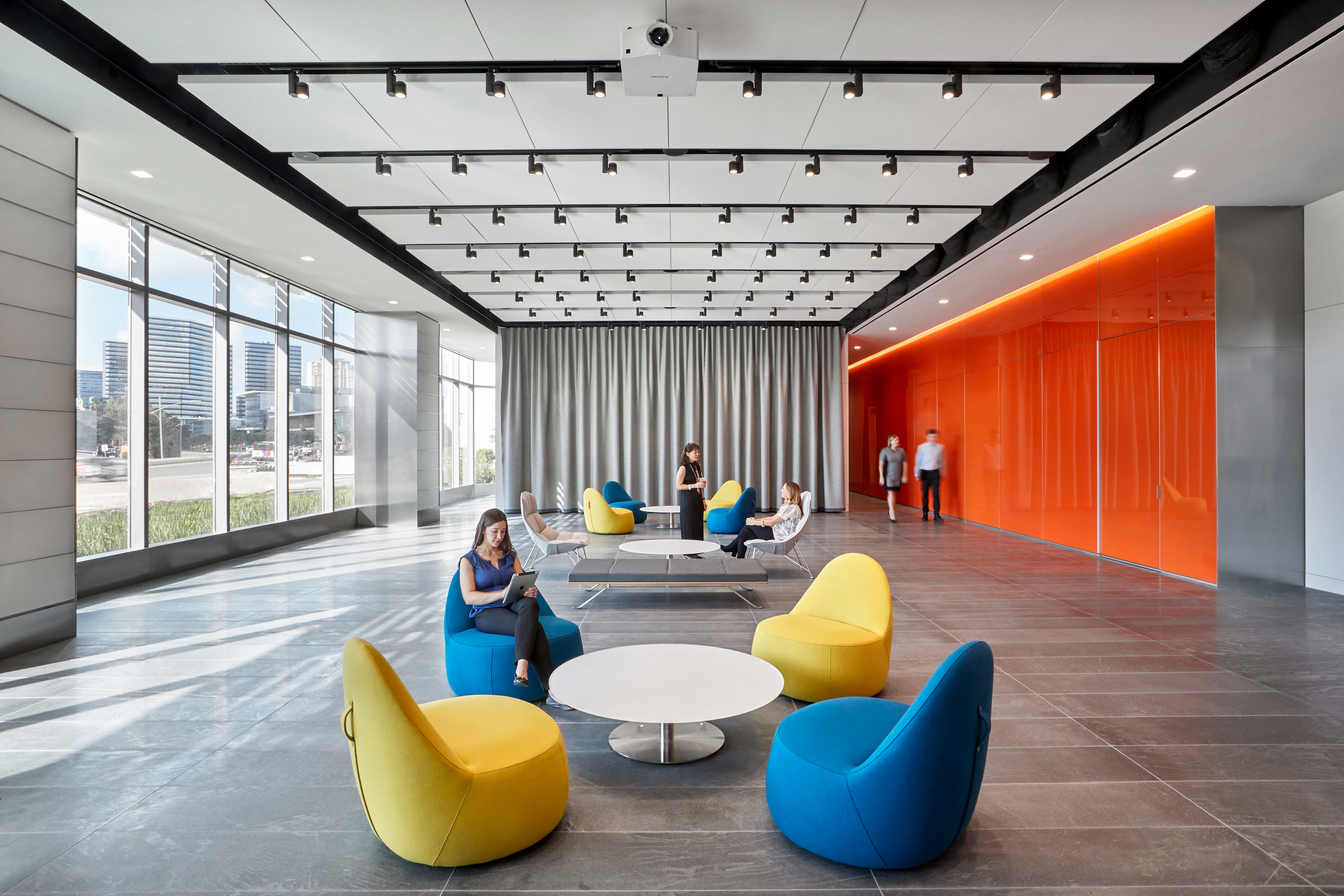
The engagement center, an area to gather and share information, maximized the space by covertly hiding multi-level stadium style seating that recessed into a back wall. When collapse a large, thick felt curtain completely covered the seating structure. We were asked to provide a simple design that tied into other design efforts within the building that would be hand stitched into the felt surface using the company brand color. Photography by Gensler Architects.
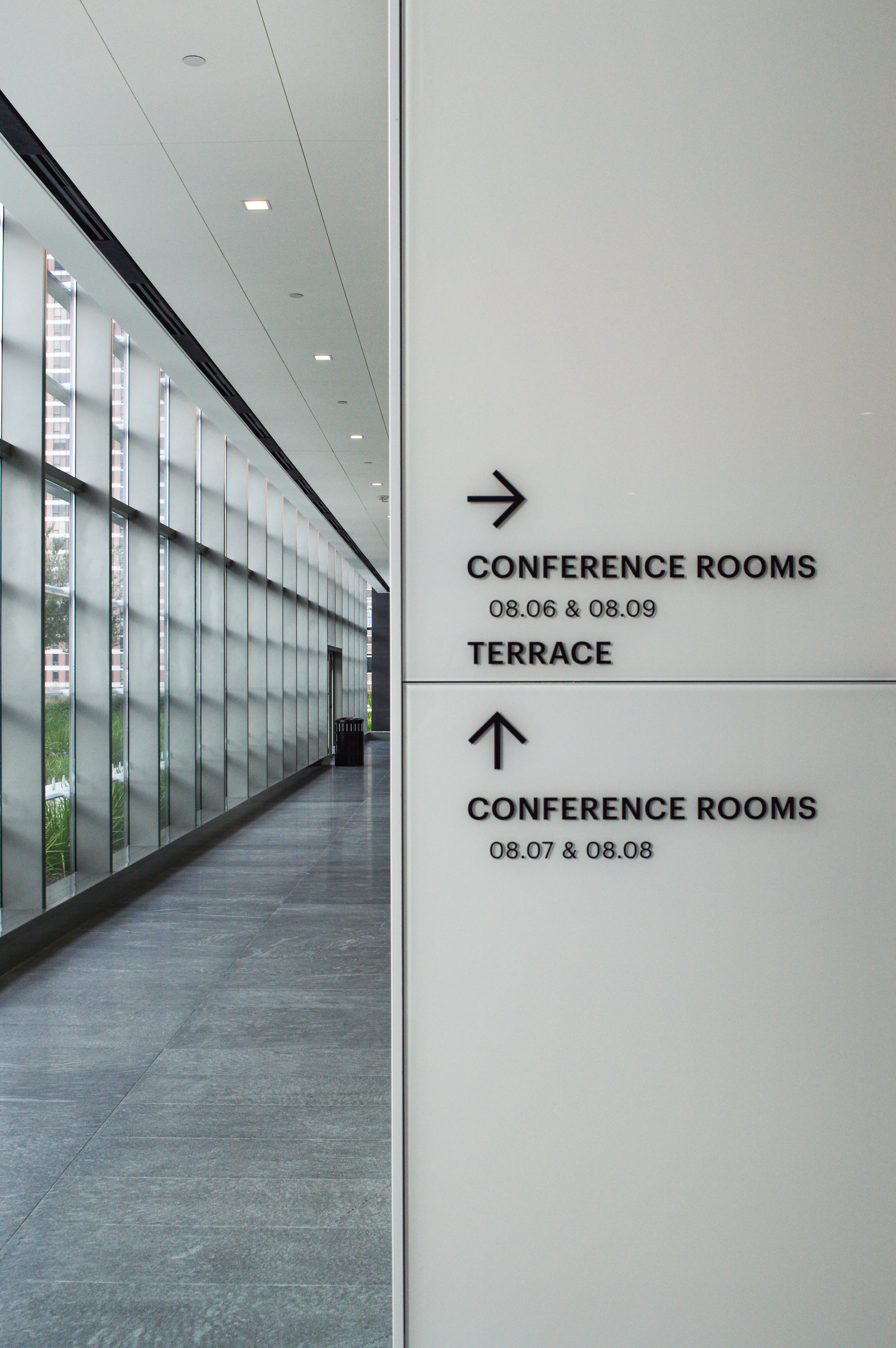

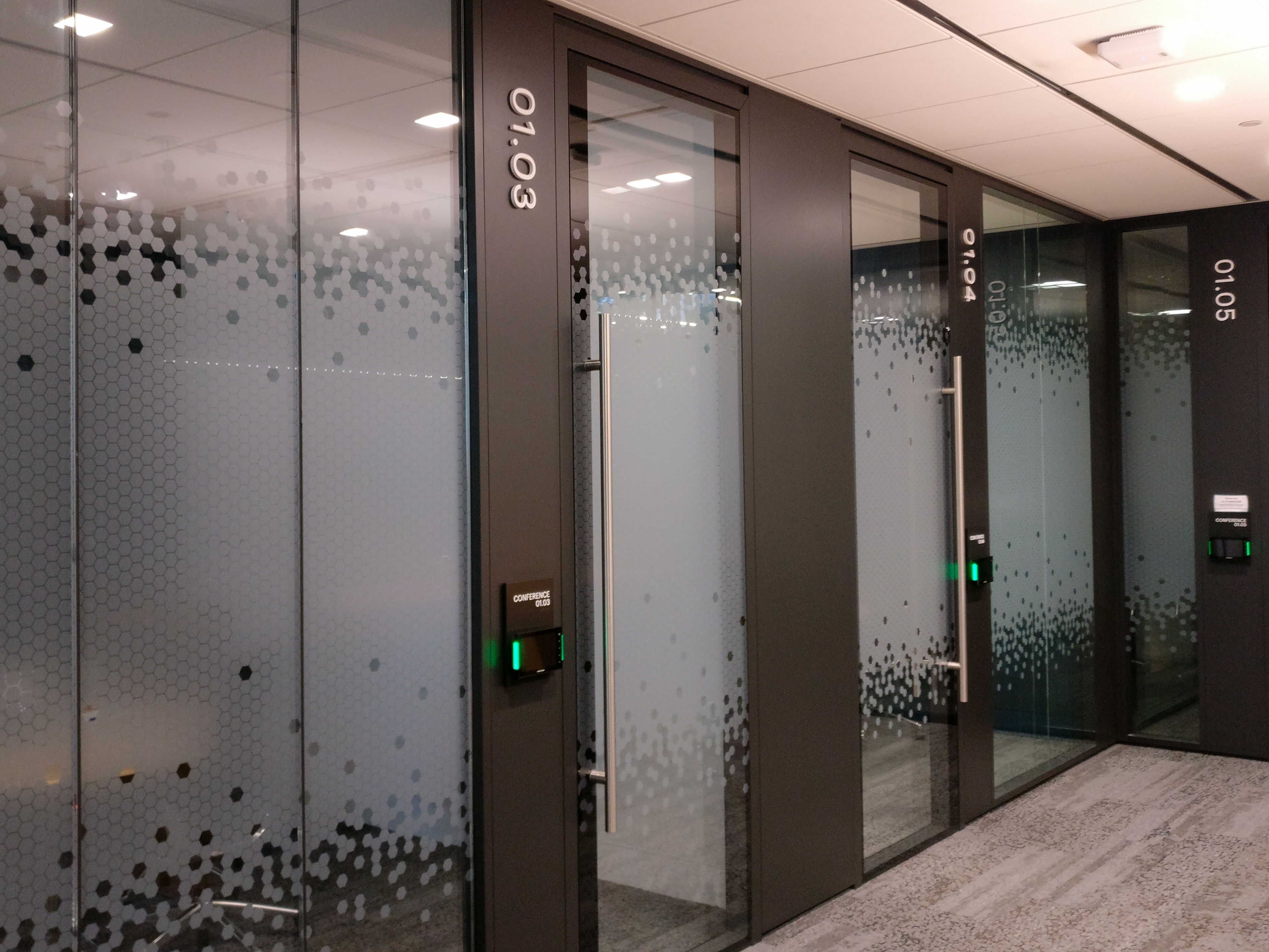
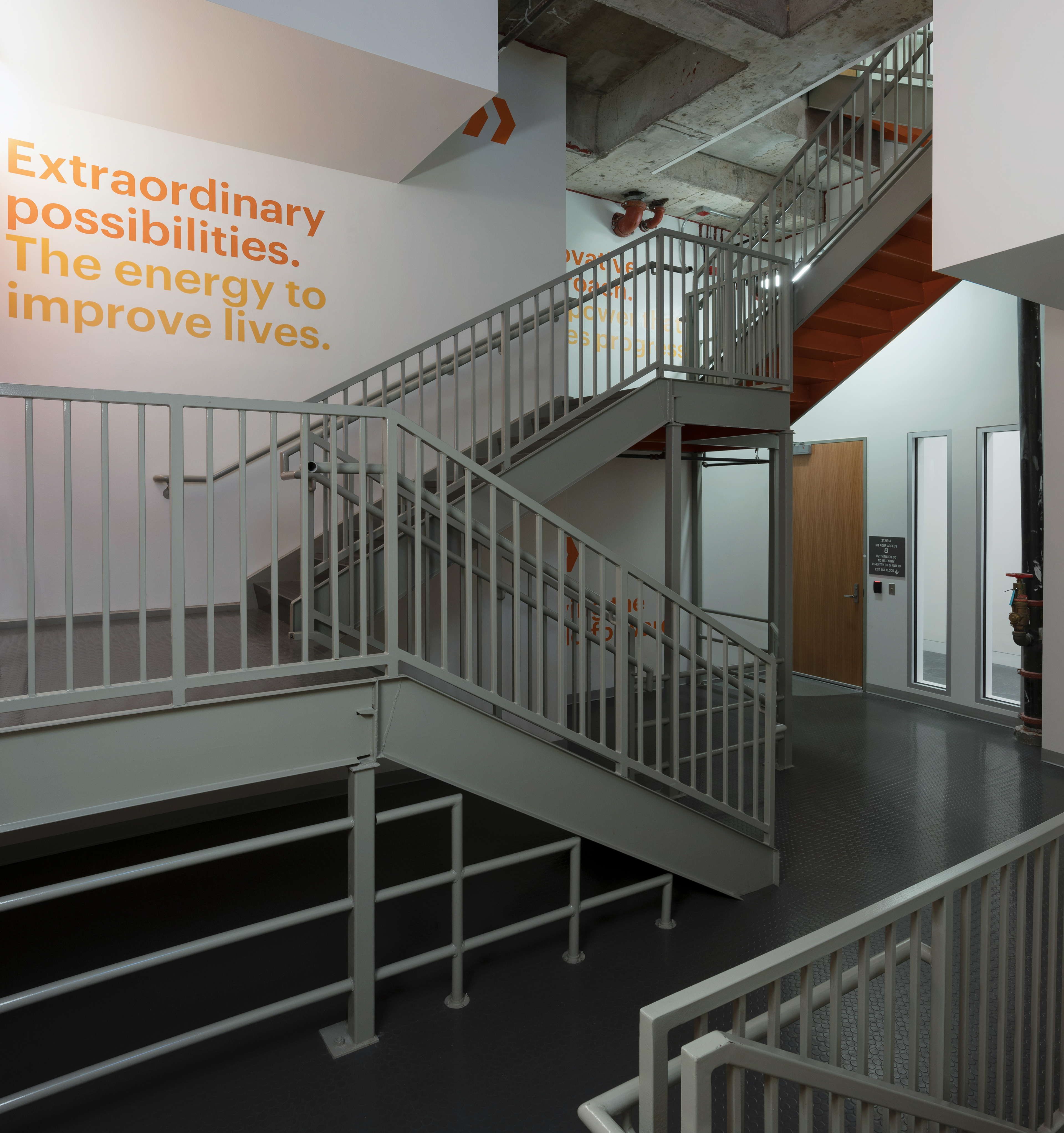
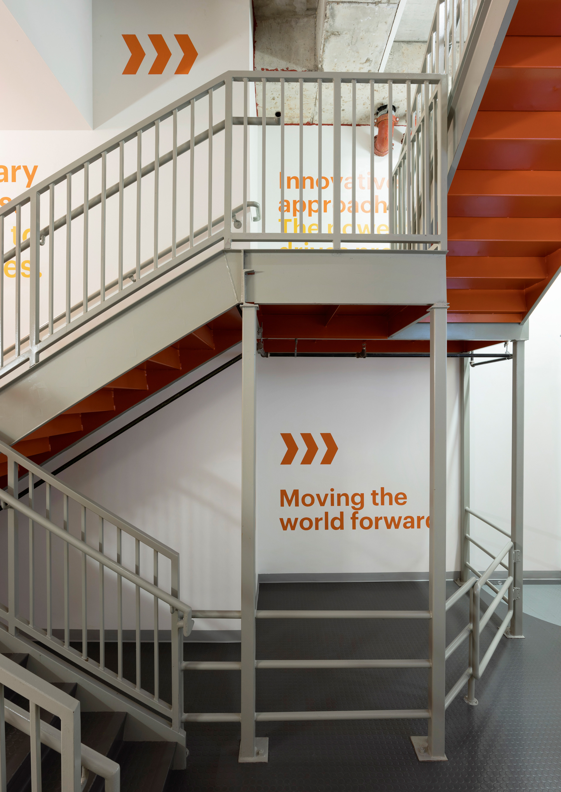
Looking down one of the corridors in the conference center. These large doors open for events. It is skinned with a custom designed film to reduce exposure from the sunlight. Wayfinding is located at strategic points throughout the level to easily move visitors from location to location. The design is meant to be clean, modern and understated.
Photography by Jack Thompson
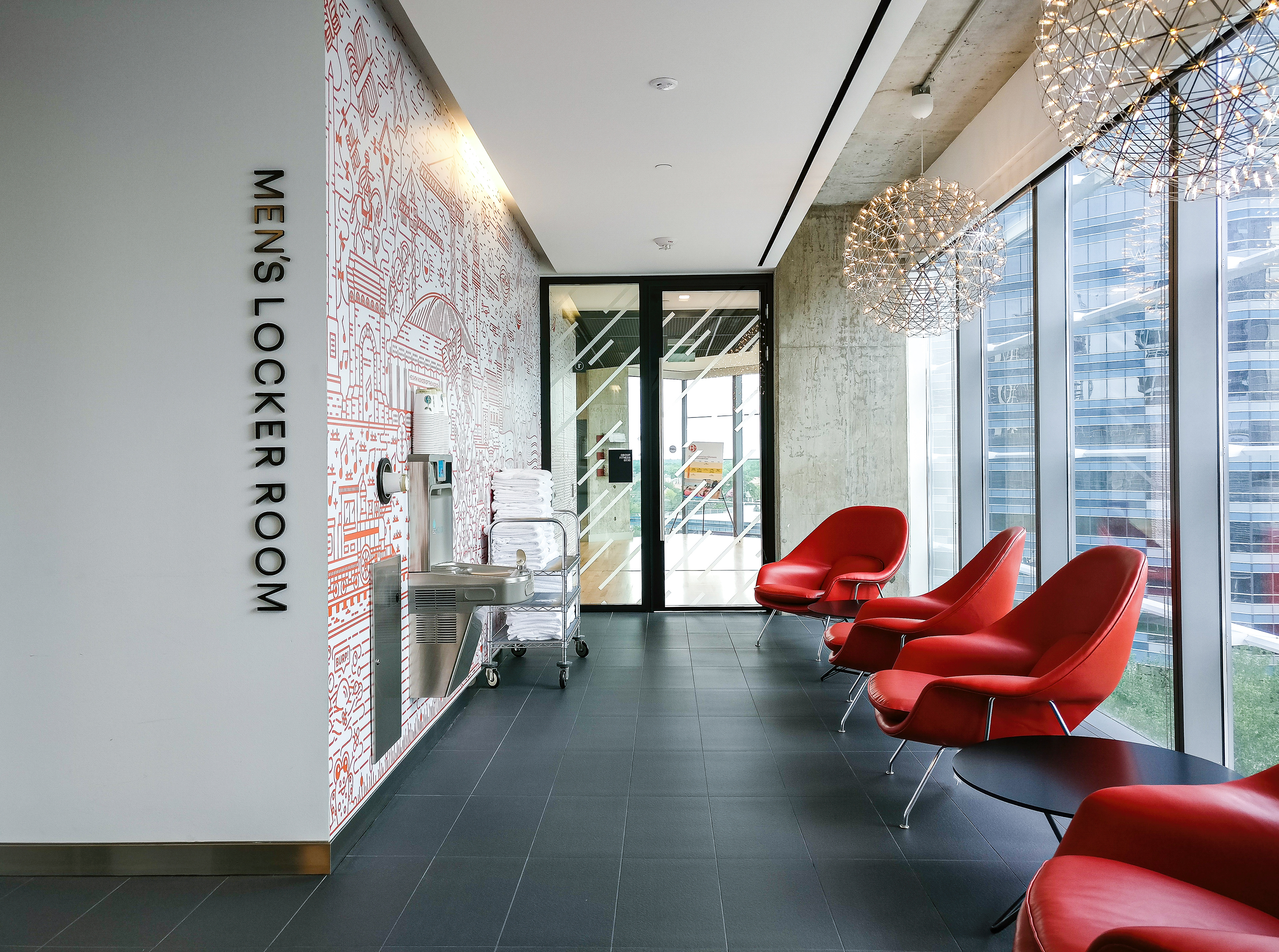


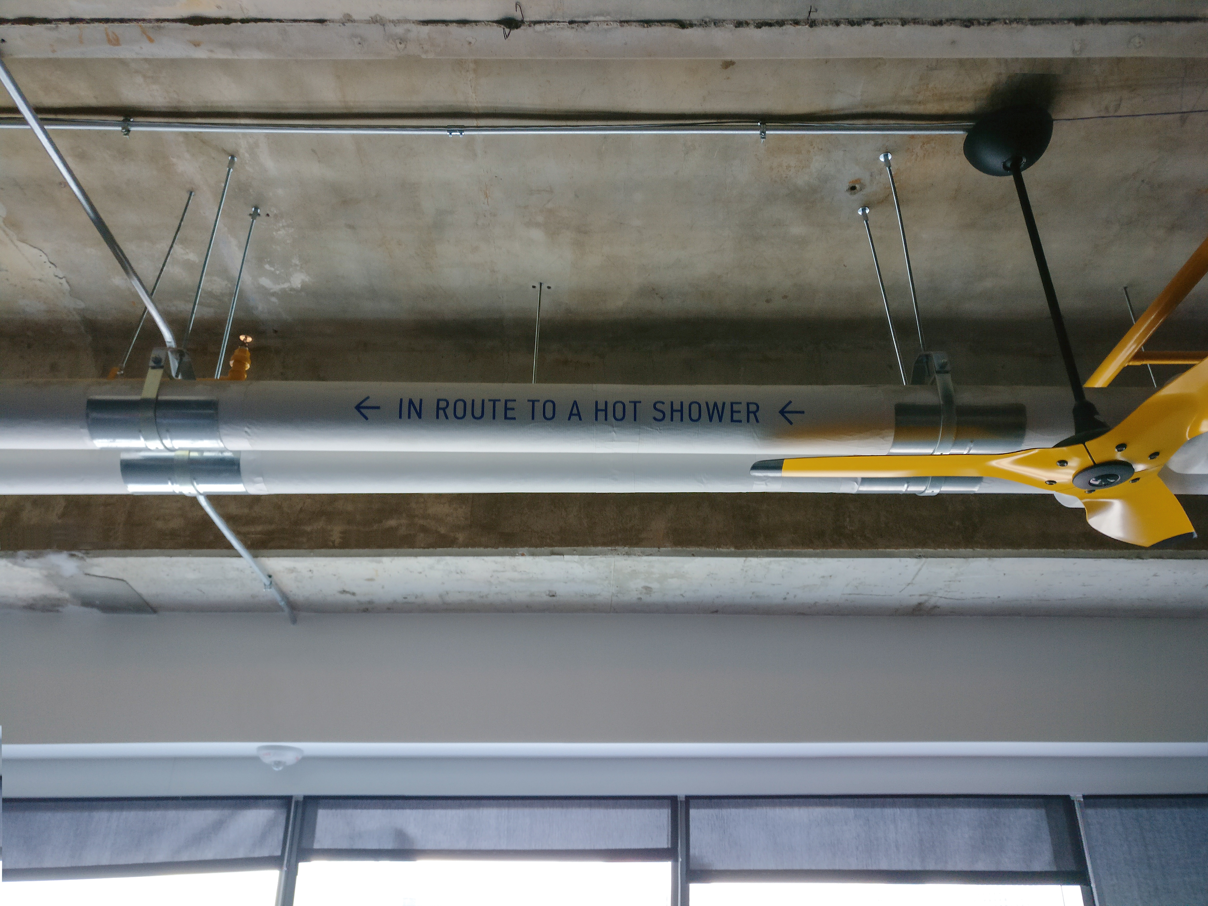

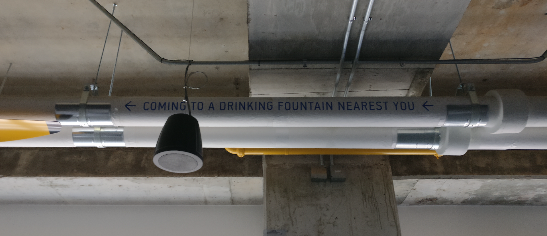

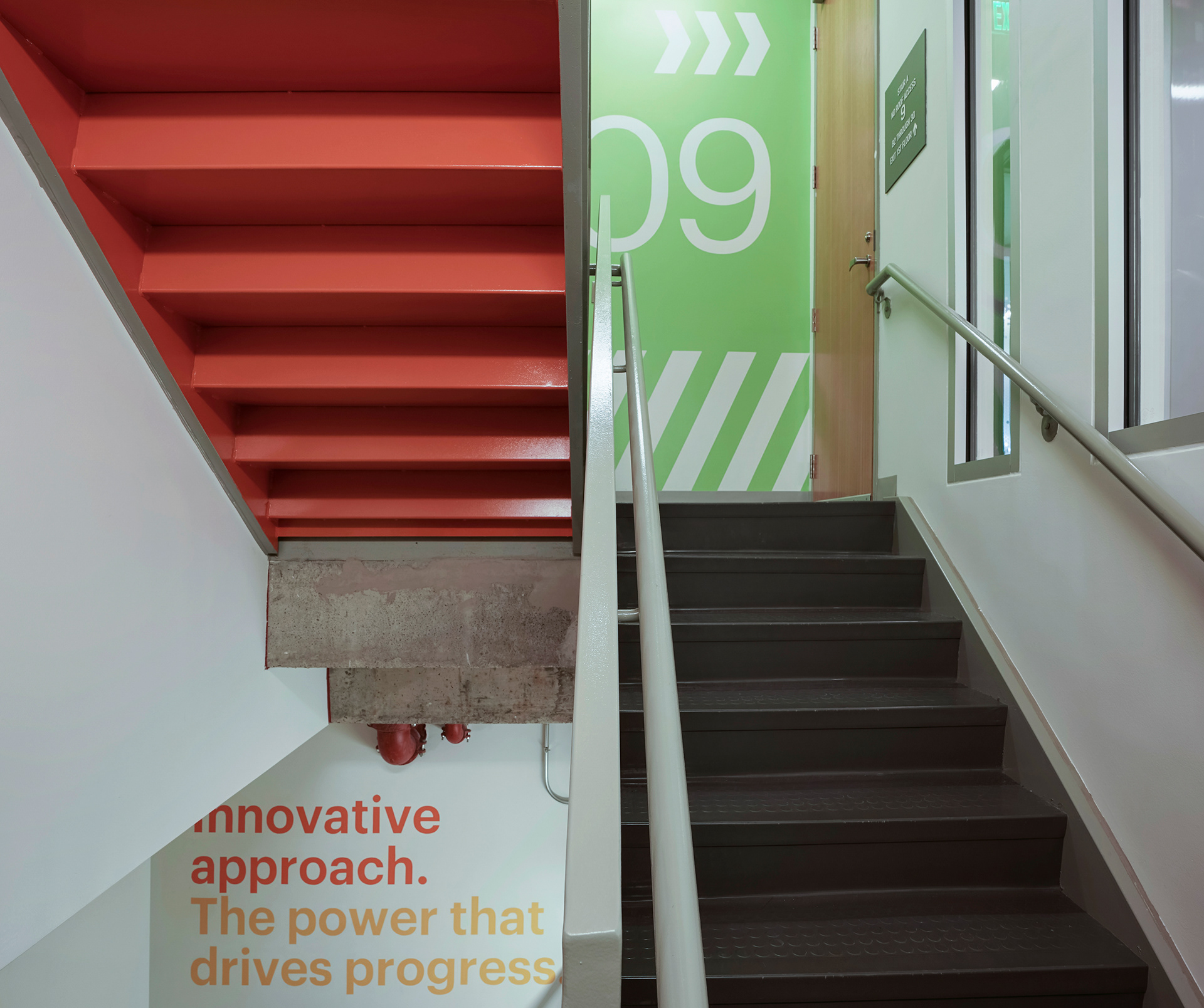

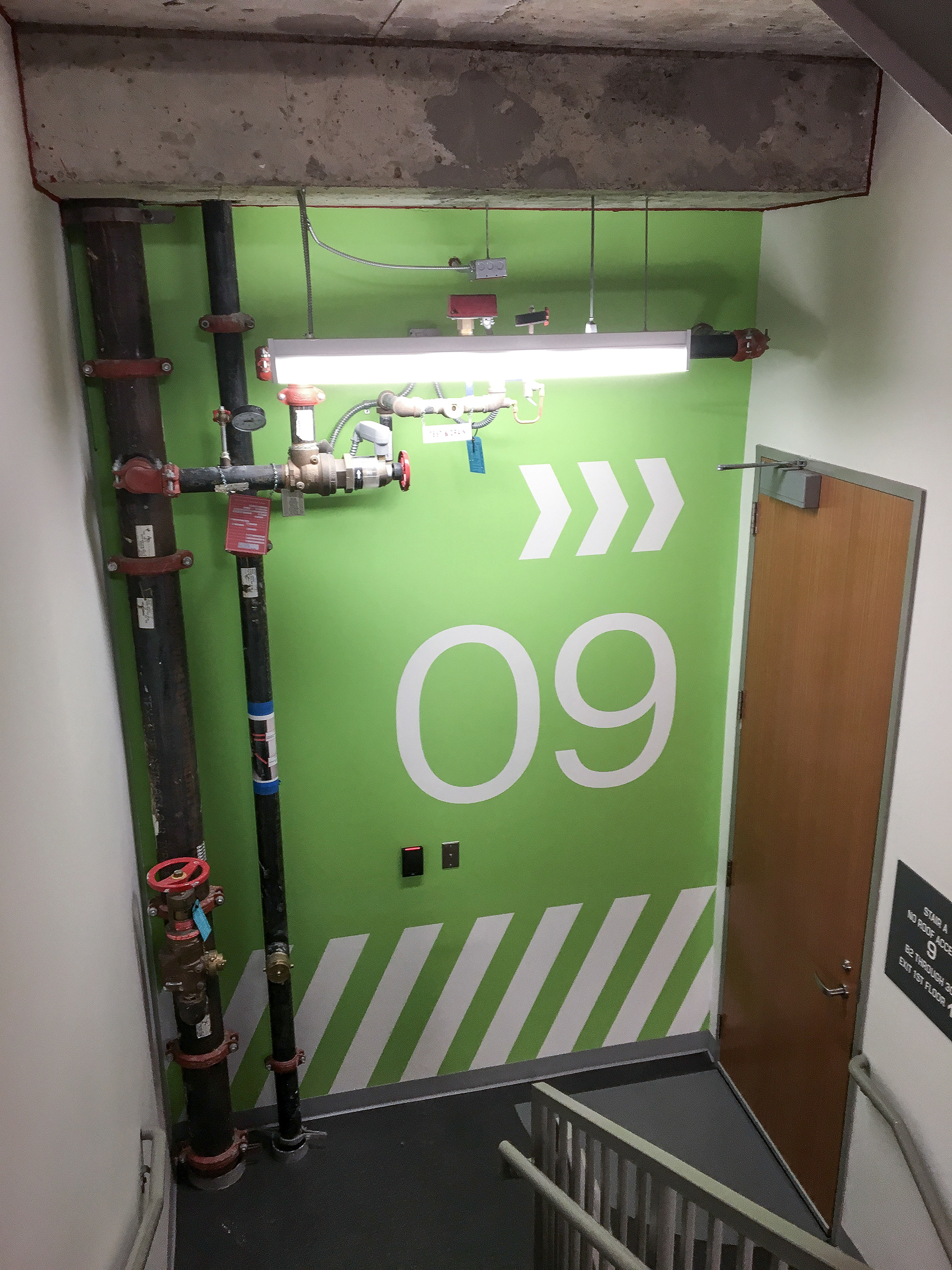
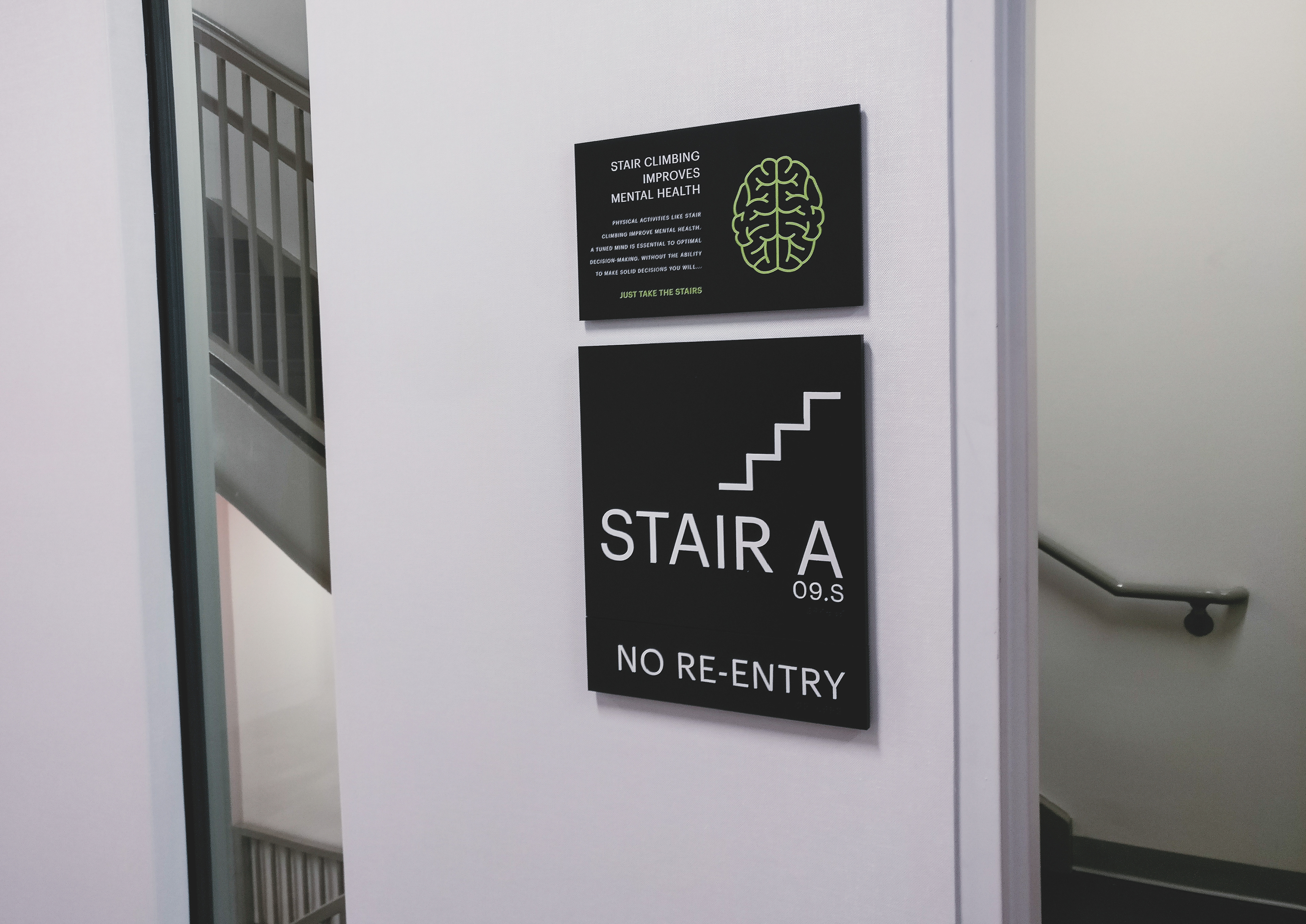
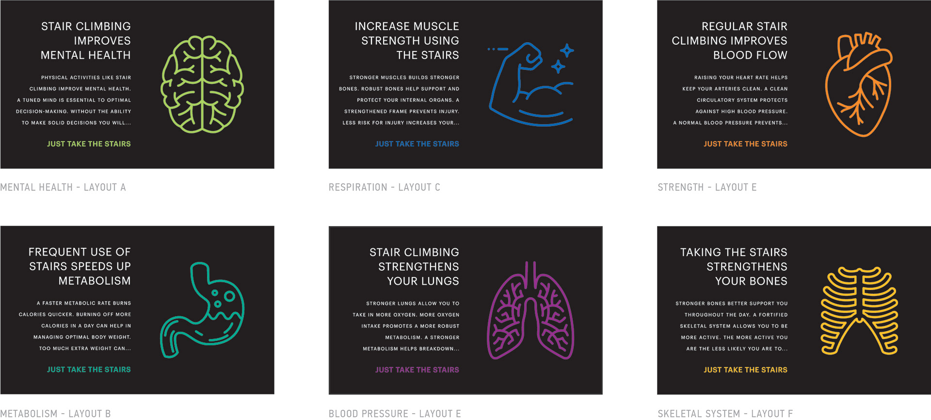
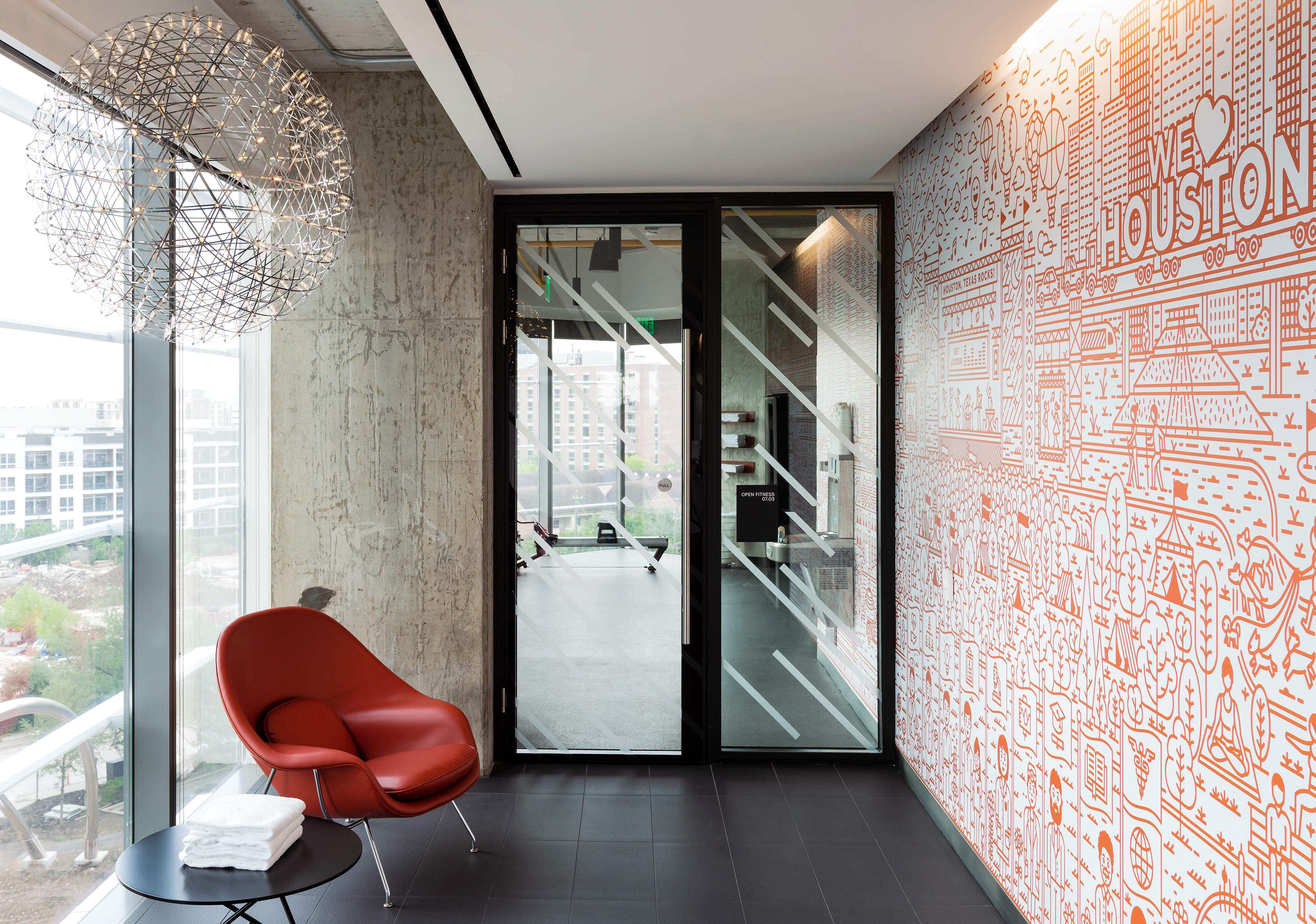
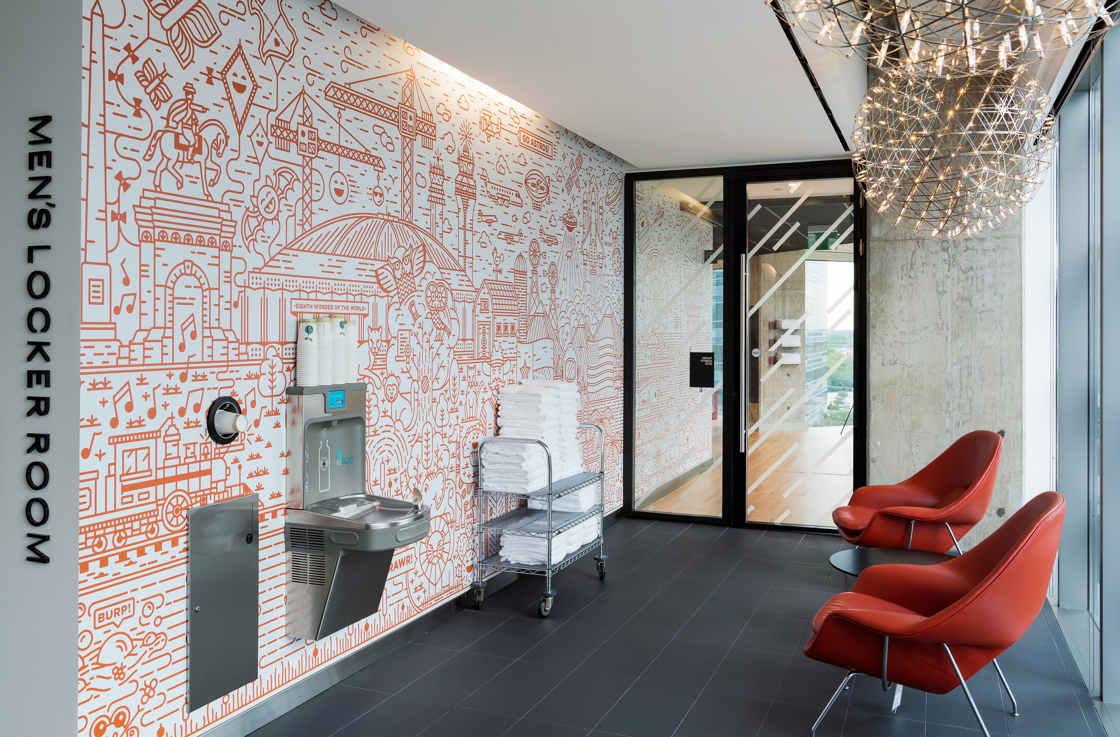
Another health-aware signage opportunity was created to promote use of the stair over the elevator.


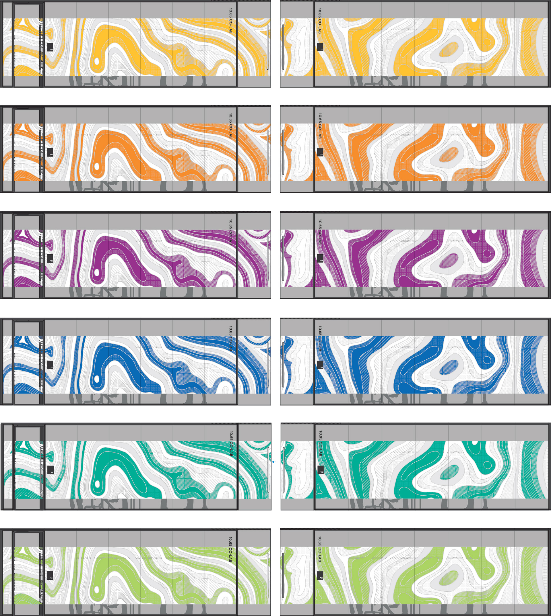
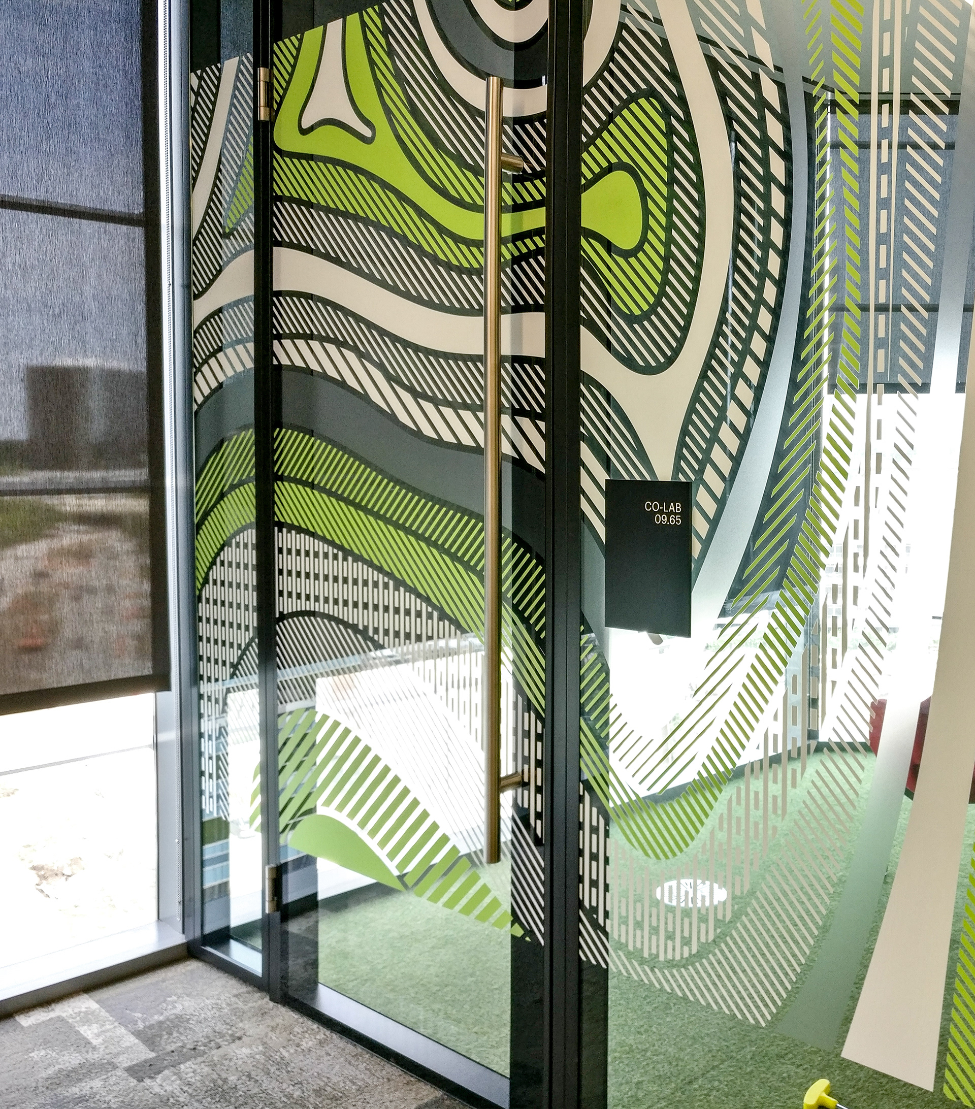
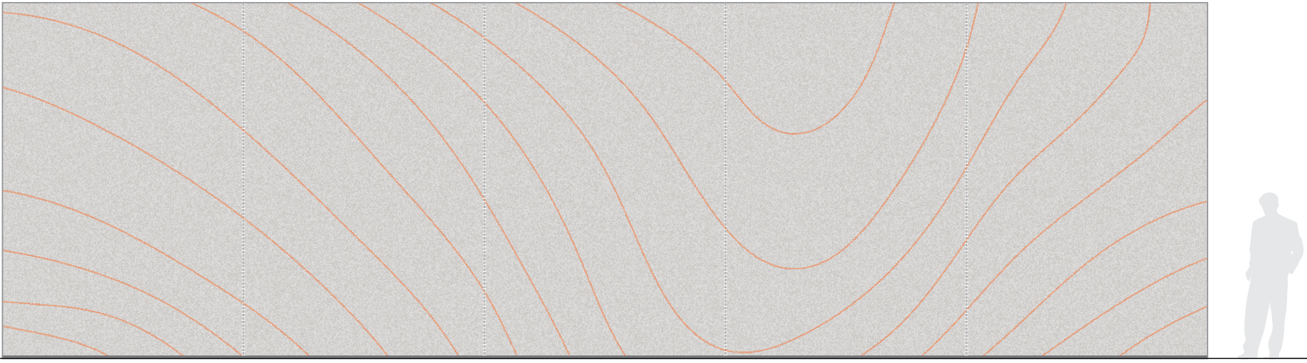
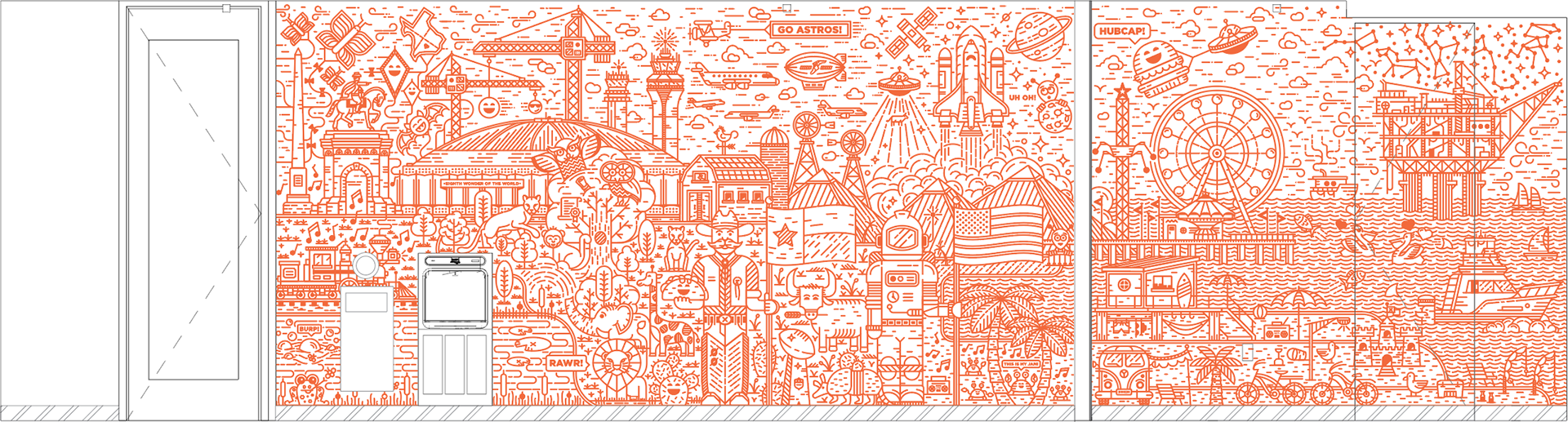
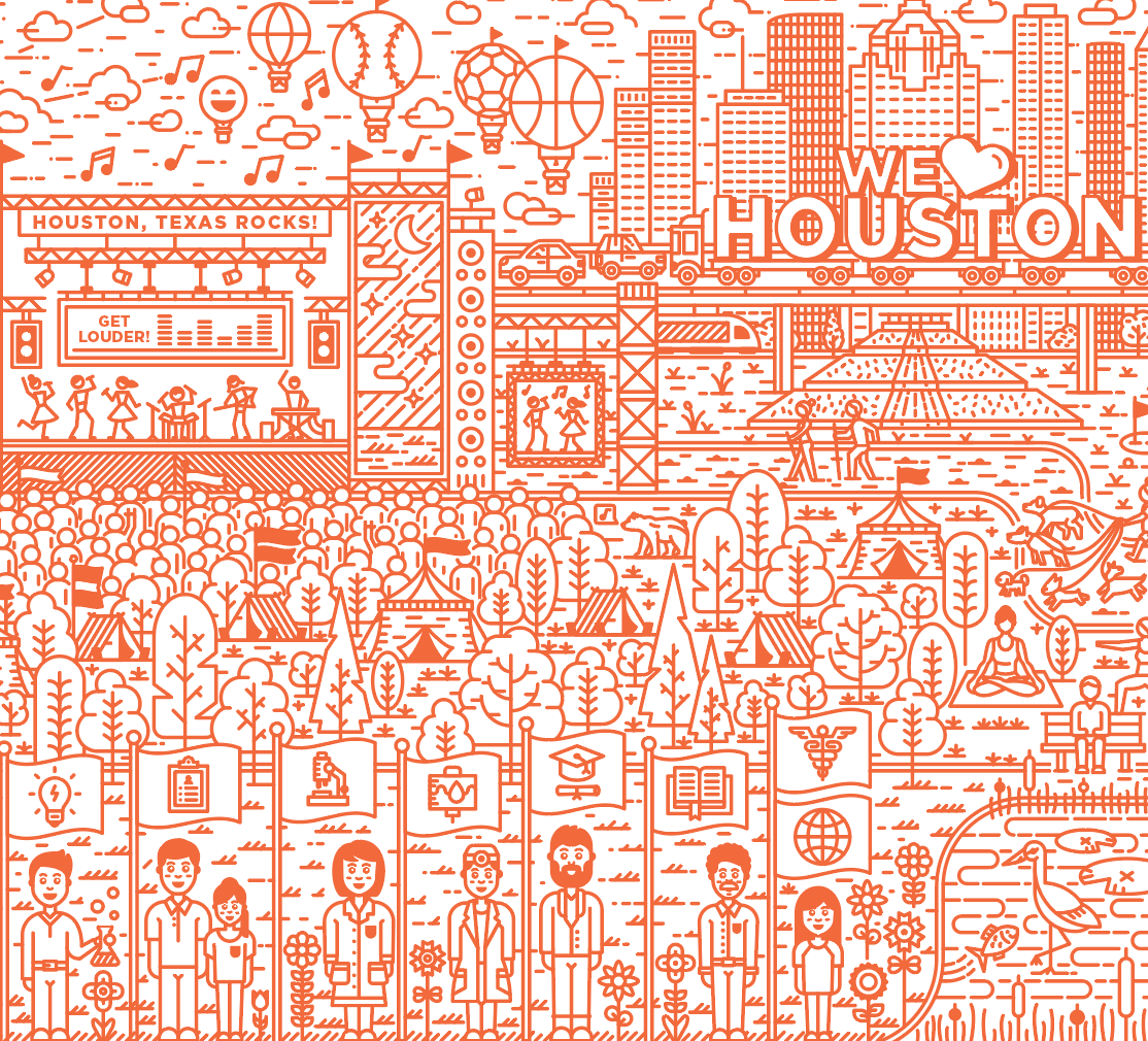
Every tenant floor collaboration room received a colorful art installation. The design was created using topography, thermal and seismic maps to create a unique design. There is a repeating color palette sequence of 6 colors that restart after every sixth level as you move up the building. The application is optically clear vinyl with extremely high quality ink printed directly to the surface.
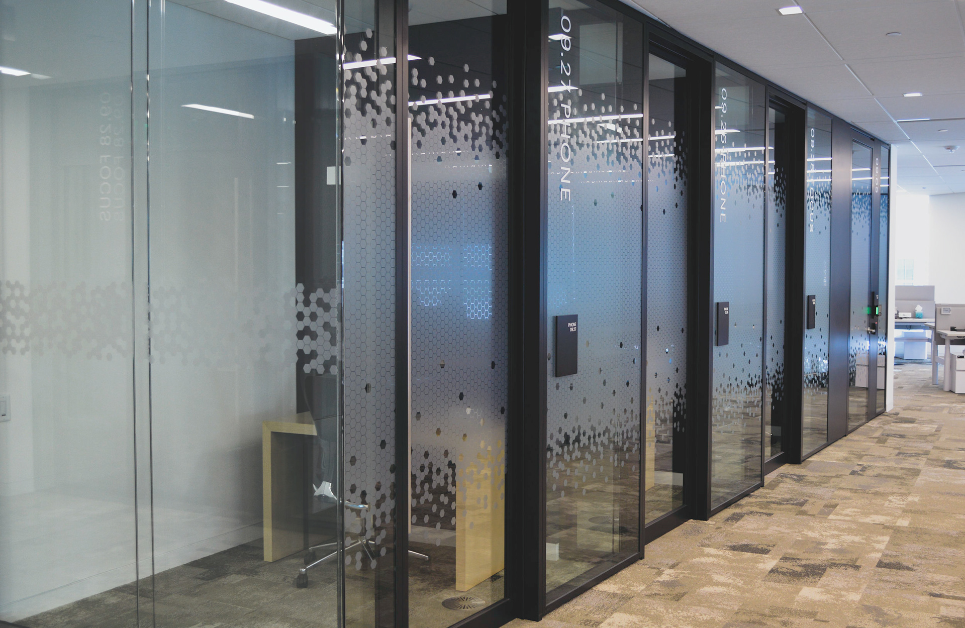


Each space required a different level of privacy. We created a suite of design option for use in these conditions. We reached this point by listening and understanding the different requirements and testing each design. Many options were considered but ultimately this design concept proved most complementary and effective within the space.
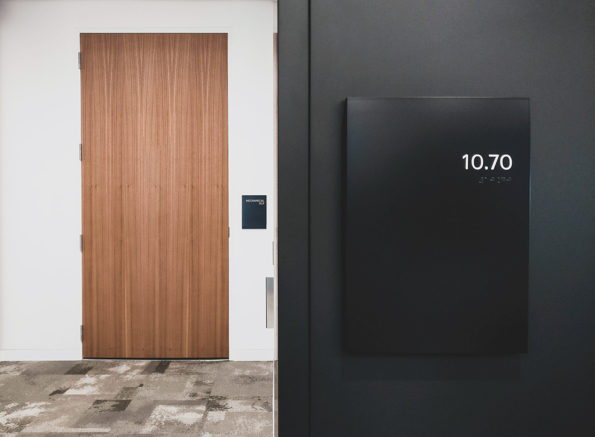

Clean and simple blade signs. A hang line was set for the mounting height to bottom of the sign and each sign added in a location would stack above to keep it all coordinated and consistent.

Photography by Jack Thompson

Photography by Jack Thompson

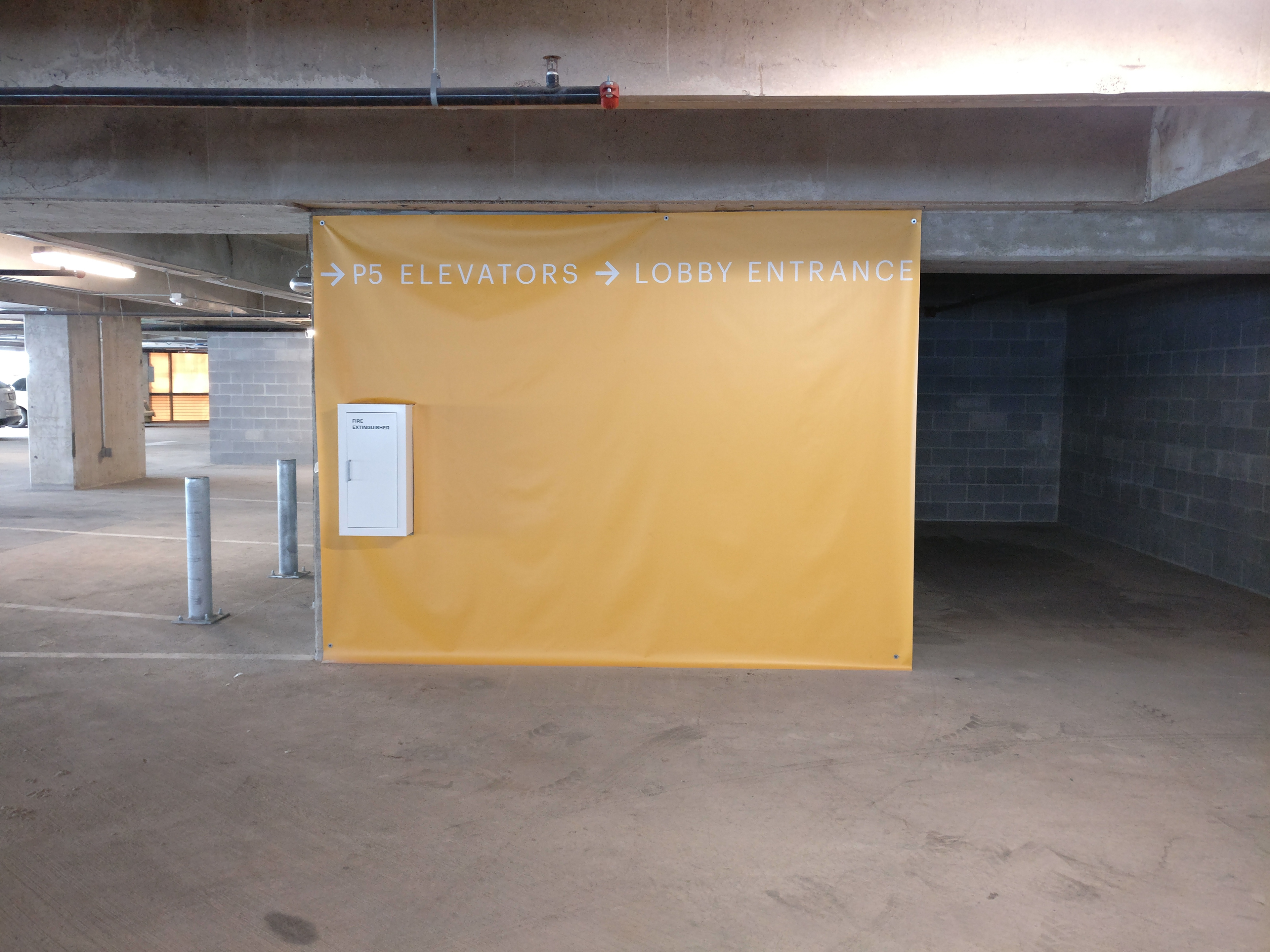
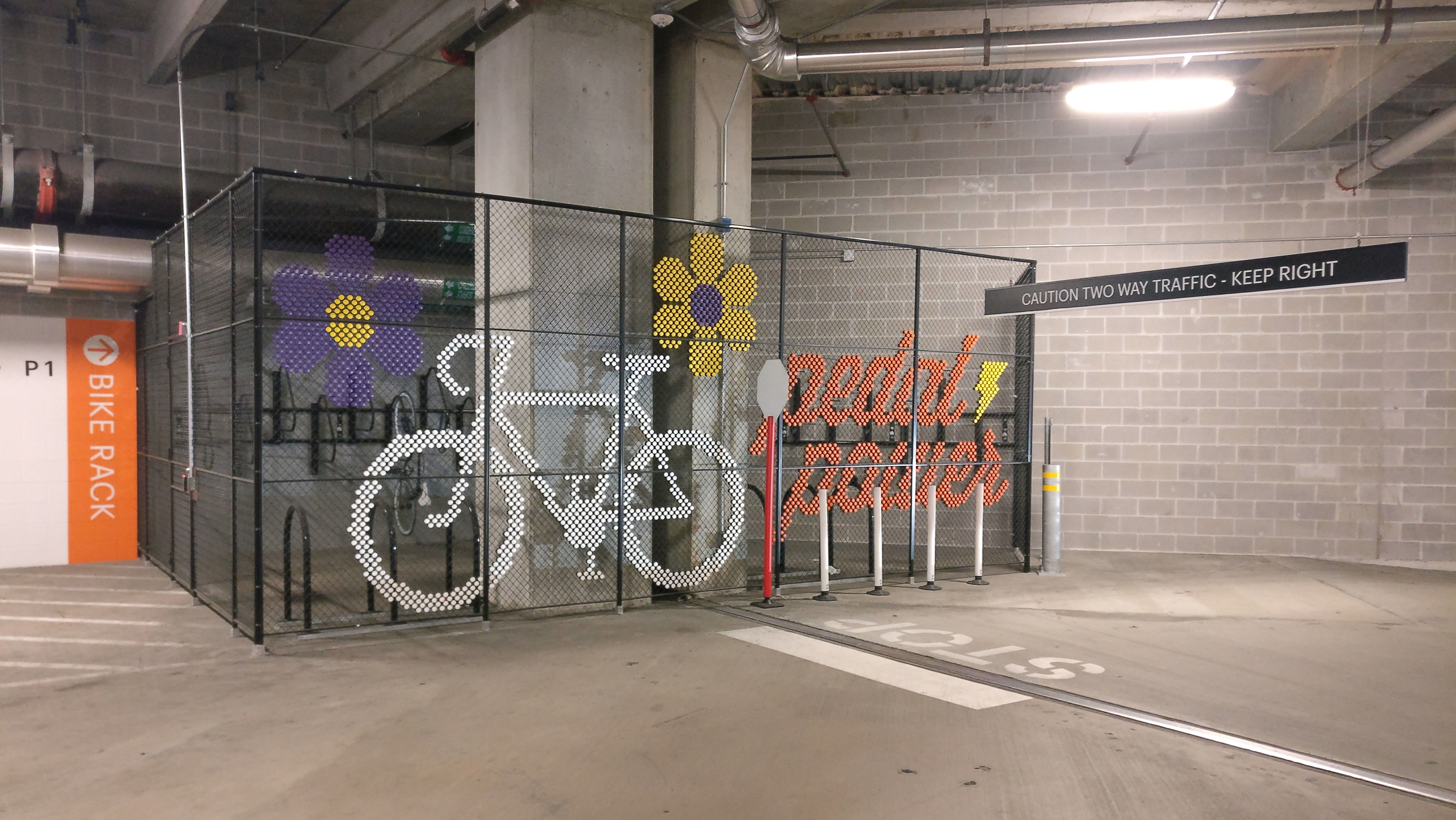
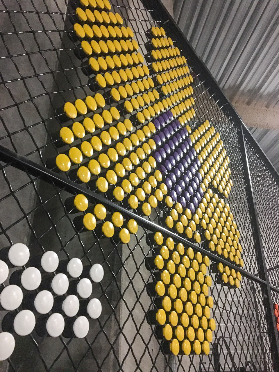
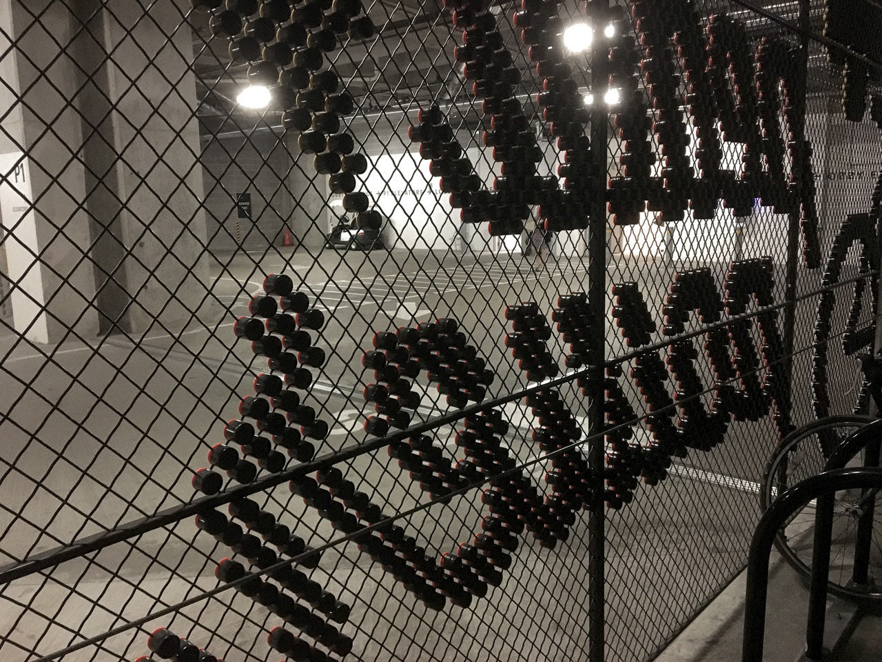
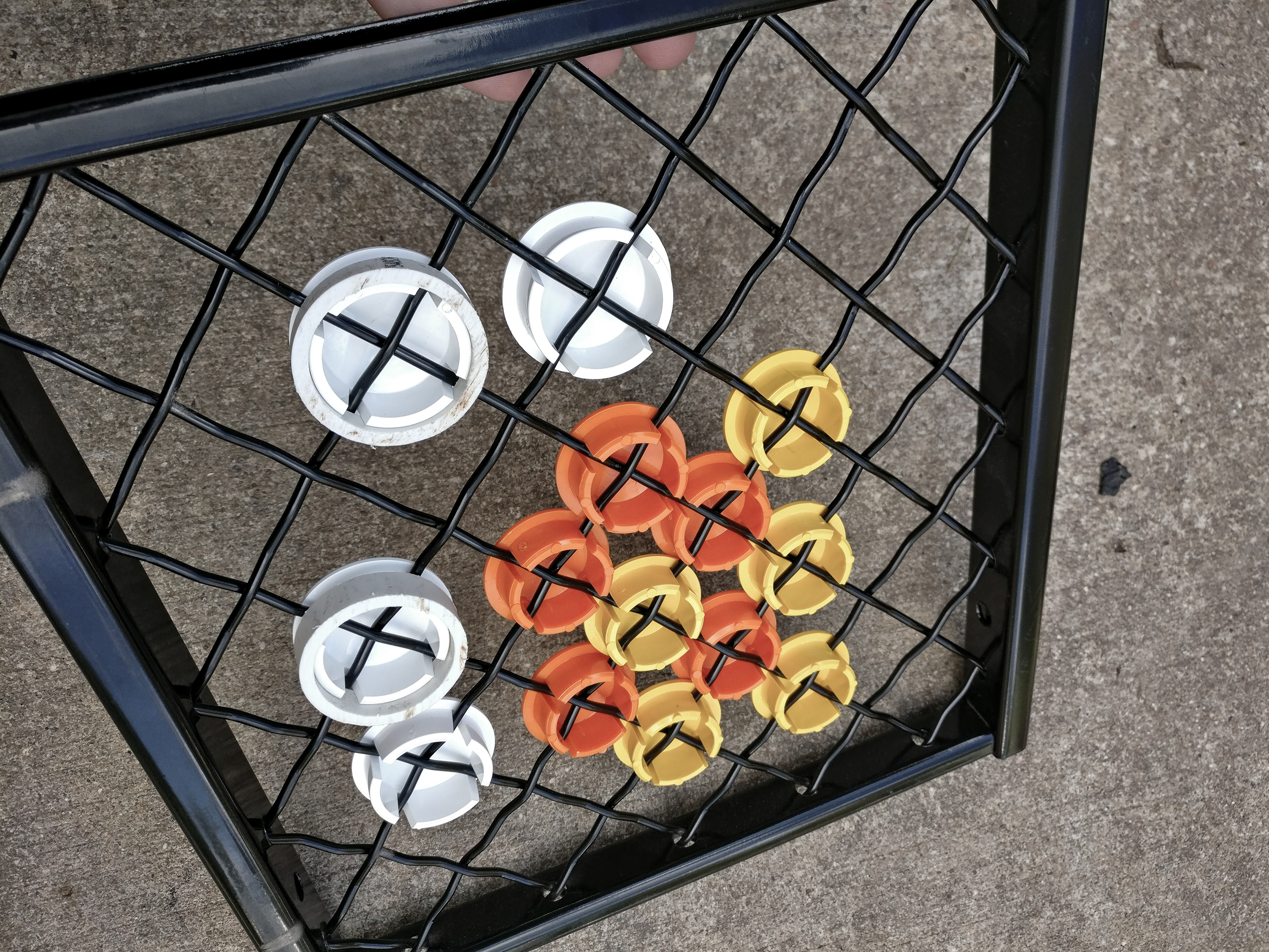
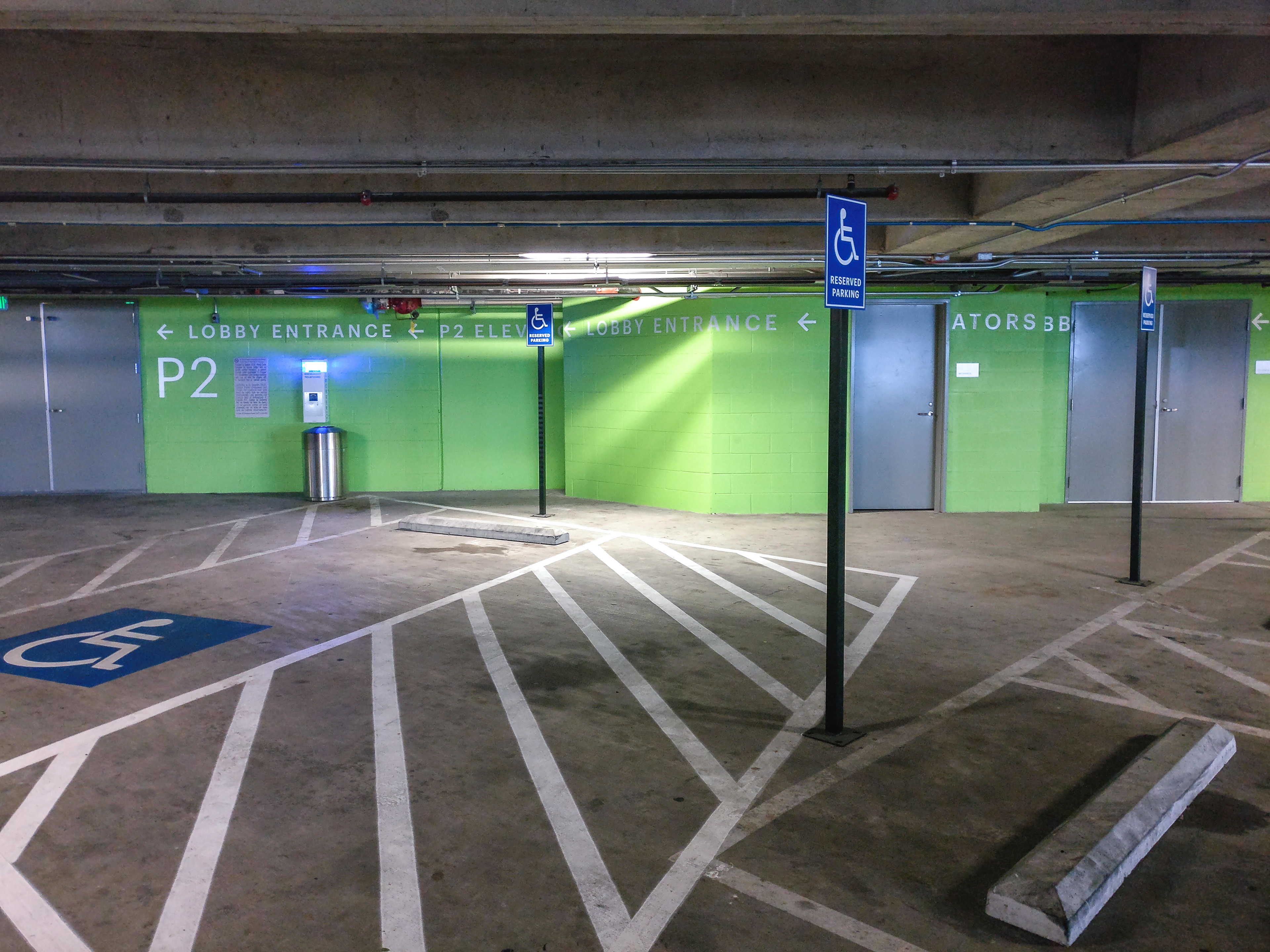
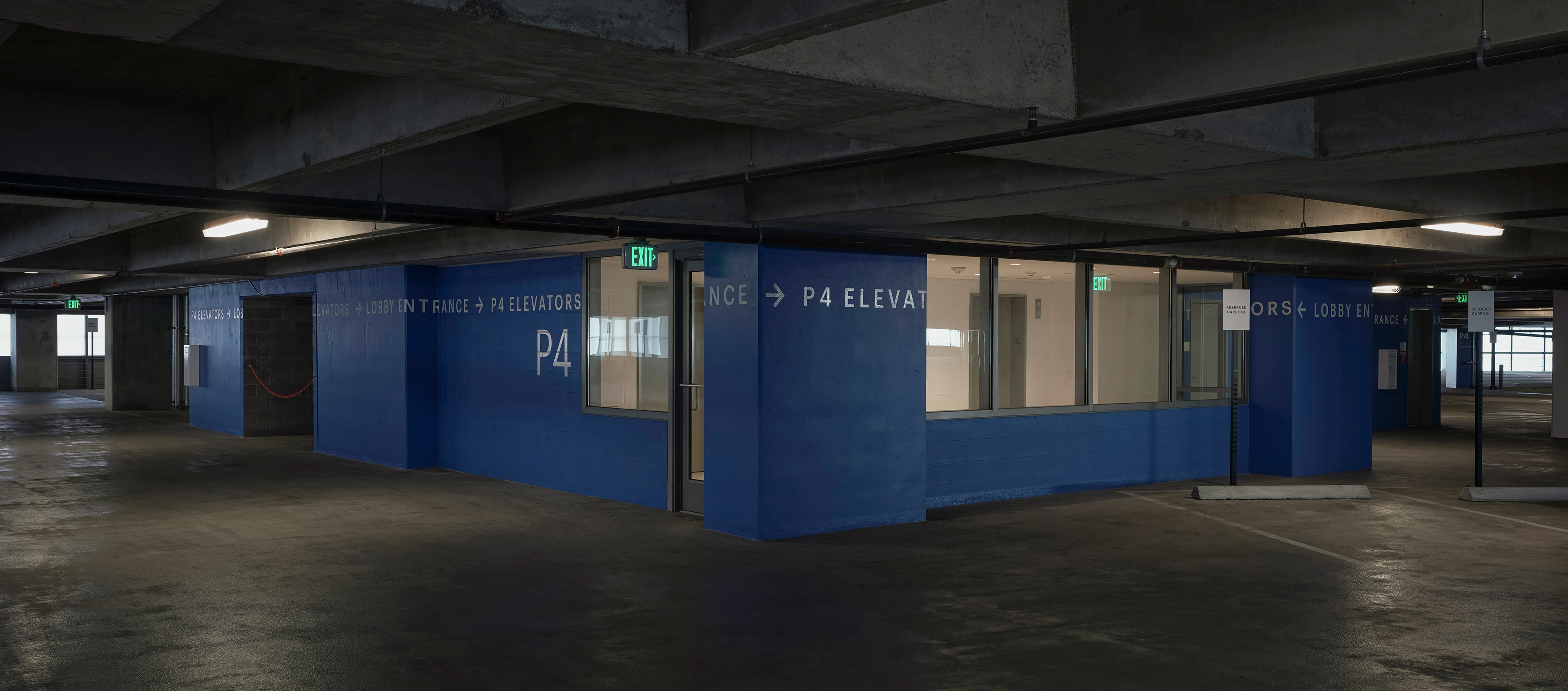
Testing of the full coverage color and visual impact throughout the garage space. This was also tested to ensure the color stayed within the building and were not easily seen from outside the building. Full scale color mockups were printed to vinyl and draped on a handful of levels.


Photography by Gensler Architects.
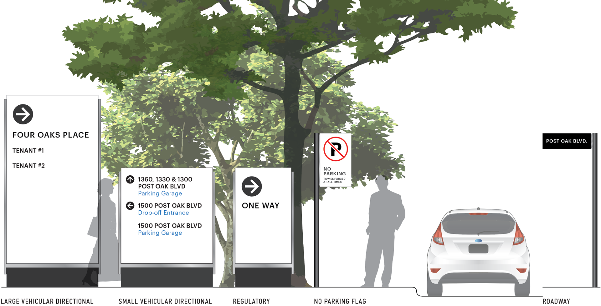
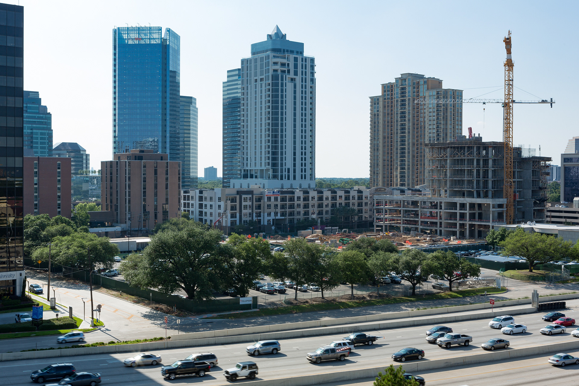
We also were tasked with updating the entire Four Oaks campus signage system. We got as far as initial signage programming and conceptual design before this scope of work was put on hold. It was never put back on the table, but it was still a great exercise in good clean, functional design.